Optigo Intelligence
An AI-powered app for Freddie Mac Multifamily, built with an integration to the company’s document repository. Designed and delivered almost entirely in code, across three versions and counting.
Confidentiality Note
This was proprietary internal work at a financial institution. Every screen below is a faithful recreation rebuilt from memory and notes, and all names, loans and data shown are fictional and non-confidential.
About
The team
- Working with the Tiger Team 🐯, an internal product team dedicated to rapid AI development
- I’m one of 2 UX designers on this project, alongside my colleague Pum
- Our designs have been delivered in code, prototyped in Kiro; engineers use the repo as reference for styling, interaction, and design system compliance
The opportunity
- Existing general-purpose tools like Copilot can’t reach our loan document repository, due to the sensitive nature of the data
- Opportunity for an AI tool that can query sensitive documents for employees with access + automate rote business tasks
V1 landing page design: 2 ways to start
July 2026
The team’s Product Owner said Optigo Intelligence would have 3 types of functionality for MVP:
- The ability to fetch documents from our internal document repository system, called DMS, with a loan ID
- The ability to query a large policy document known as the Seller/Servicer Guide (or S/S Guide), which users reference constantly in these workflows
- A handful of narrow-scope AI skills that leverage DMS document data
She asked for our help with UI design + thinking through the UX of the product. This was our first iteration of the landing page:
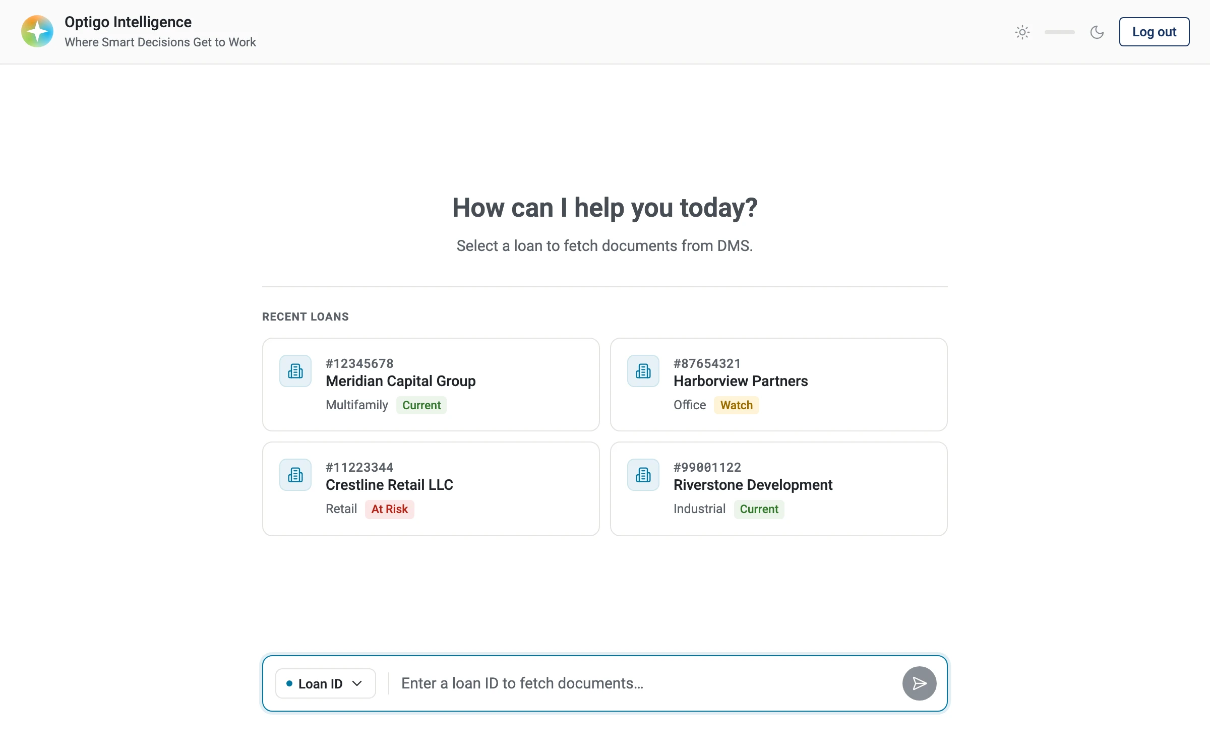
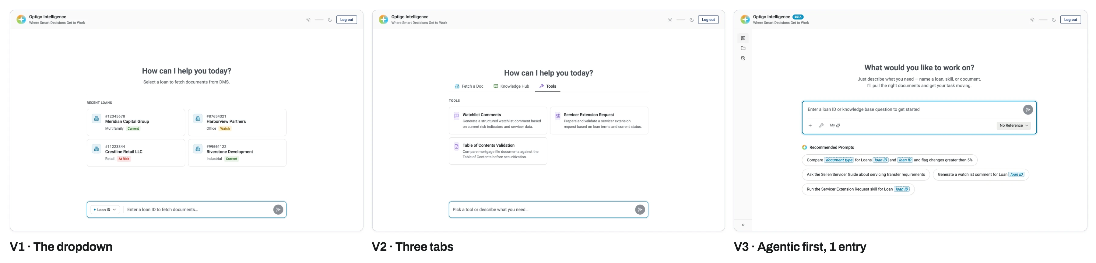
Our design centered around a hard requirement from engineers that fetching documents needed its own separate chat input. For the DMS call to work, the user could enter one loan ID at a time (and nothing else). Under the hood, it would write a prompt for the agent to query DMS for documents associated with that loan.
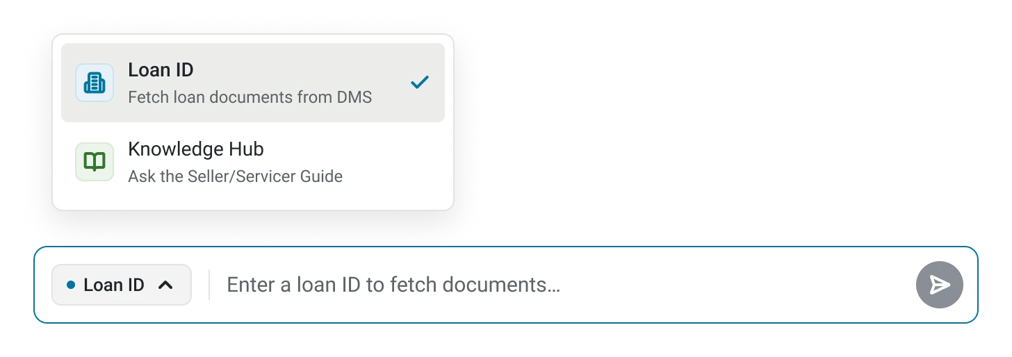
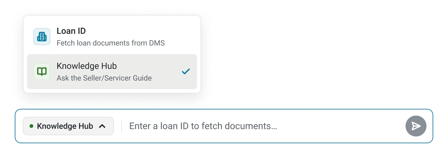
To accommodate this, we opted for a dropdown toggle, similar to how users might select a model in other AI chatbot tools. The default would be set to Loan ID.
Emerging UI patterns: Temporary templates
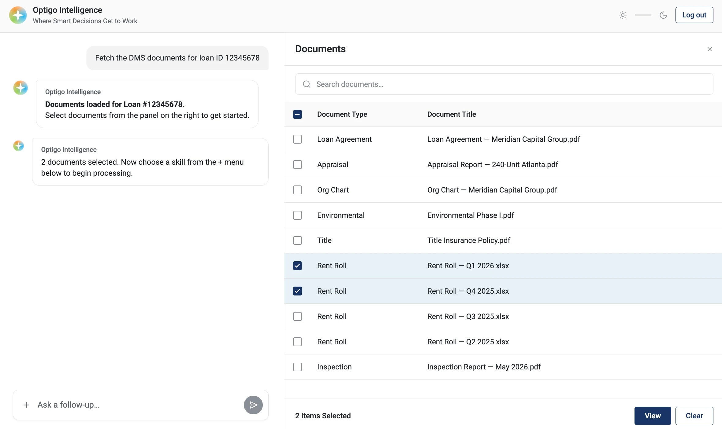
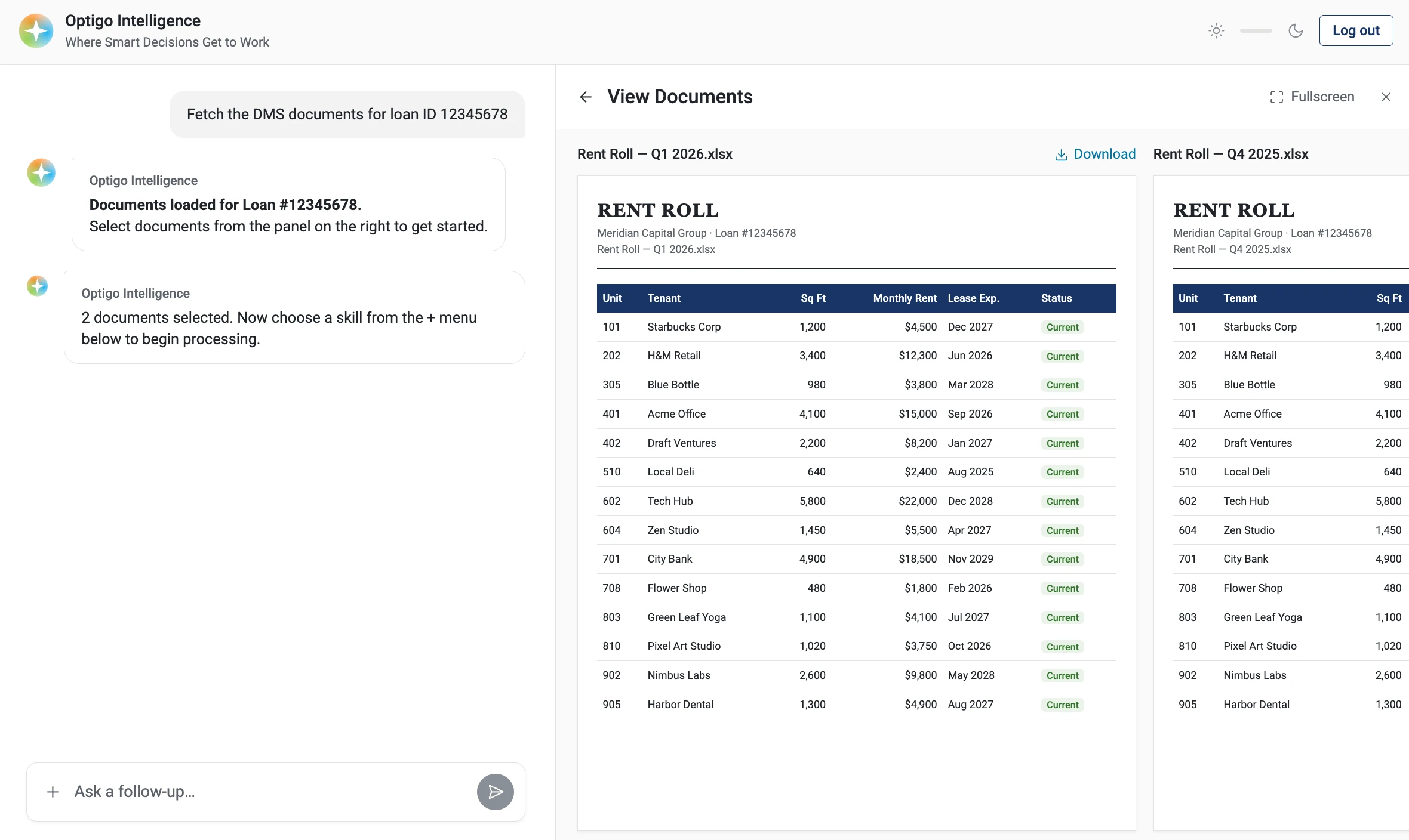
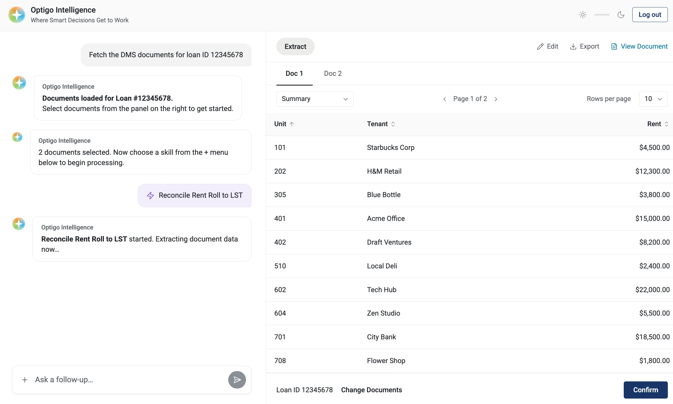
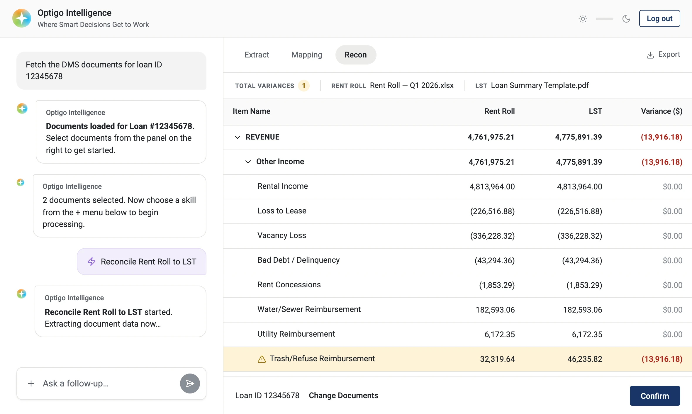
From the beginning, Optigo Intelligence was meant to be a chat-first experience. However, we knew some tasks might call for interactions better served by a persistent UI.
We designed a set of panel templates that open on the right once the agent has a loan ID. These would be temporary and only appear when needed:
- Documents: A document list + multi-document preview
- Extraction: A template to show AI-extracted values + give users a chance to edit/validate
- Reconciliation: Cross-checking the same values across documents and flagging discrepancies, automating tedious “stare and compare” work
V2: Three tabs
September 2026
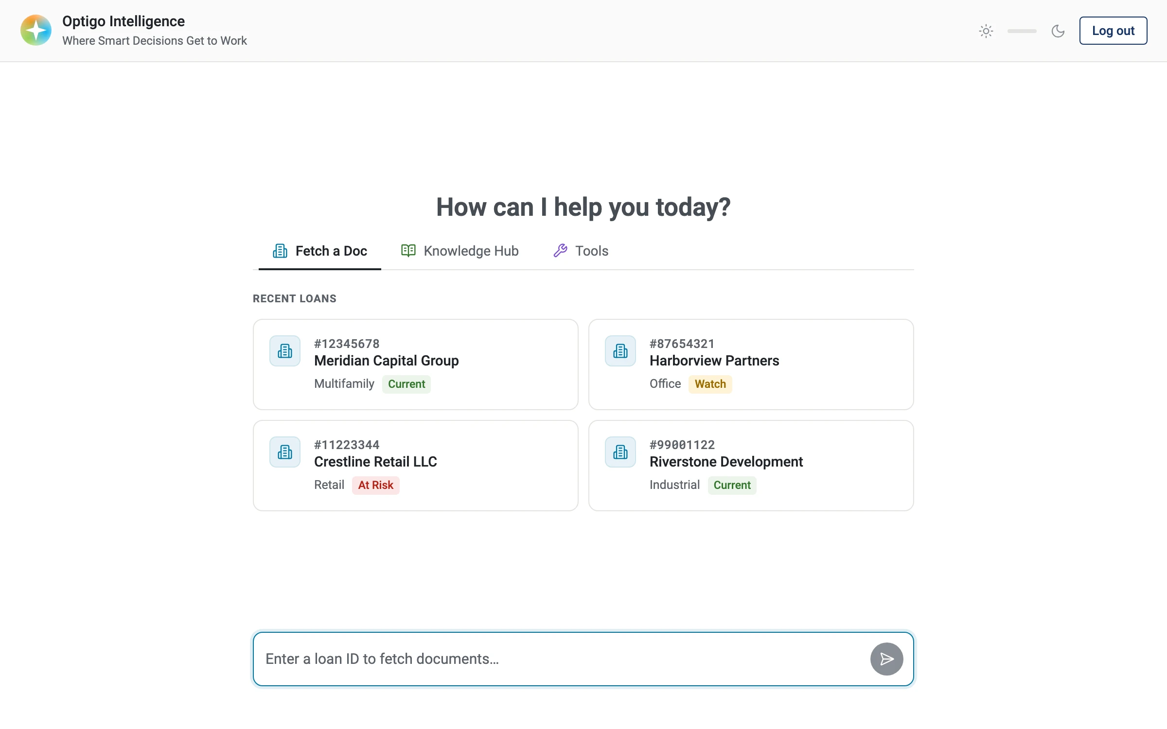
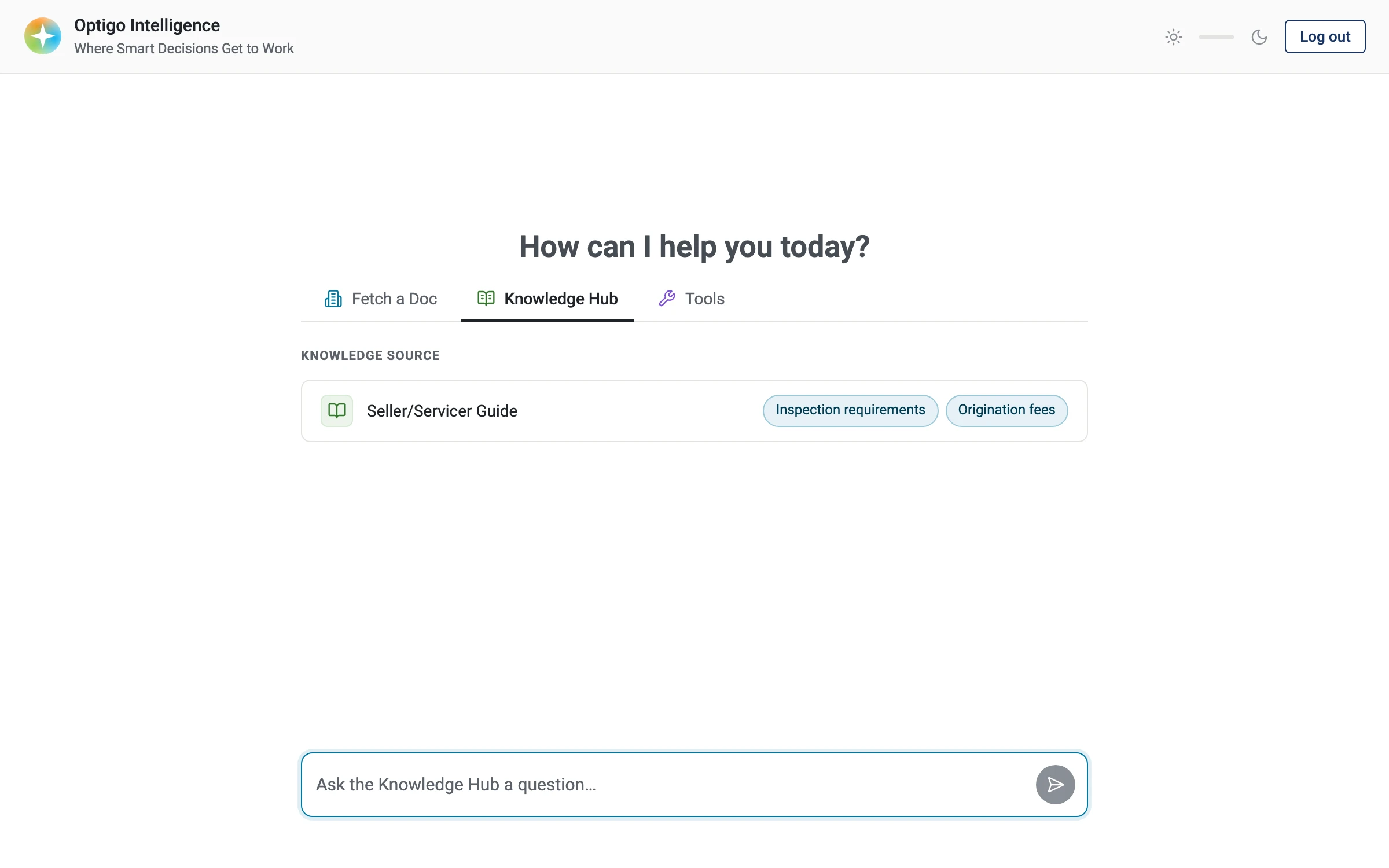
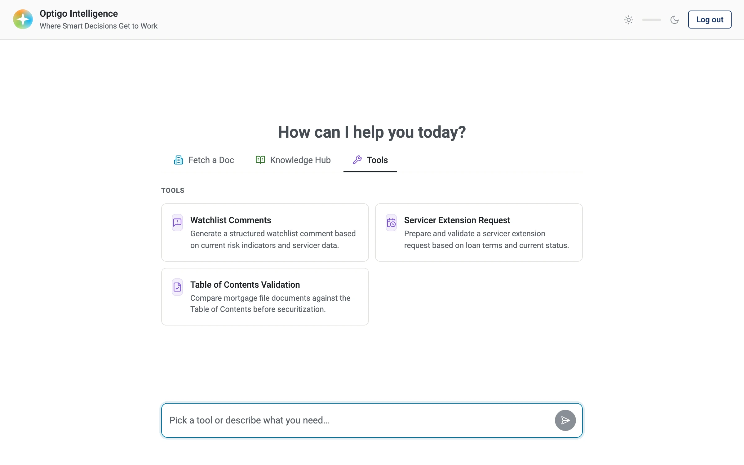
After our first round of prototyping was delivered and handed off to devs, the team was off to the races.
As they started developing the foundation of this new app, the PO was also gathering feedback from her other stakeholders internally. She came back a few weeks later with new items for us to consider.
The main thing was that they wanted some AI capabilities, called Tools, to be reachable from the landing page. This would complicate our dropdown menu design, since 3 options might be too crowded. So we went with the tab view instead.
The Tools that didn’t require Loan IDs would live on the home page, while Loan-specific Tools (with those persistent UIs from earlier) would only show after entering a loan ID.
Pilot feedback
After adopting the new 3-tab design, the product team ran two pilots with real users back to back - one with 10 users, then a fast follow with 30. Feedback was mixed, and some asks came through clearly:
- Document statusShipped in fast follow
- Ability to Alt+Enter in chatShipped in fast follow
- Multiple loans at onceHigh priority V3, see below
- Reusable promptsV3, see below
- Issues w/ Loan-specific skillsRethinking for V3 + beyond
- Chat historyDeprioritized
We had designed those persistent UI templates for Skills, but never deep-dived into the UX of each individual workflow, and in the pilot feedback that showed. The loan-specific skills ran into a lot of problems, mainly from a technical standpoint. Ultimately users didn’t trust the outputs.
According to pilot feedback, the biggest value was querying the document repository (DMS). To make better use of that, pilot users asked for the ability to query multiple loans at once, and to save commonly-used prompts in the tool.
Users also asked for some smaller UI improvements, like showing Status (a DMS-specific concept) in the Document List and the ability to Alt+Enter in the chat input, both of which the team shipped in a fast-follow.
V3: Agentic first - single point of entry
October 2026
After the first 2 pilots - and a ton of pre-deployment testing - there was a lot of feedback to consider.
UX-wise, our biggest surprise had to do with the tab view. Remember, our design centered around the premise that Fetch a Doc needed its own discrete input, with prompt logic coded “under the hood.”
In testing, the team found that the agent was smarter than initially thought. It could pick up a loan ID from a normal prompt, and even handle multiple loan IDs at once. This happened to be one of the biggest asks from pilot users, too. It turned out the tool was already capable of that - but no one knew, in part because the UI didn’t communicate that clearly enough!
So we decided to scrap the tabs, and were explicitly asked to do a more “agentic-first” experience. Our agent is smarter than we realized, we just had to design the landing page to reflect as much to users.
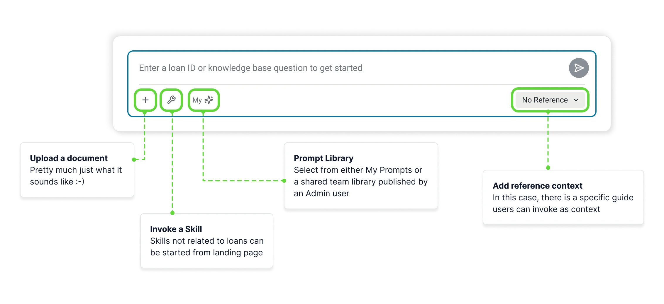
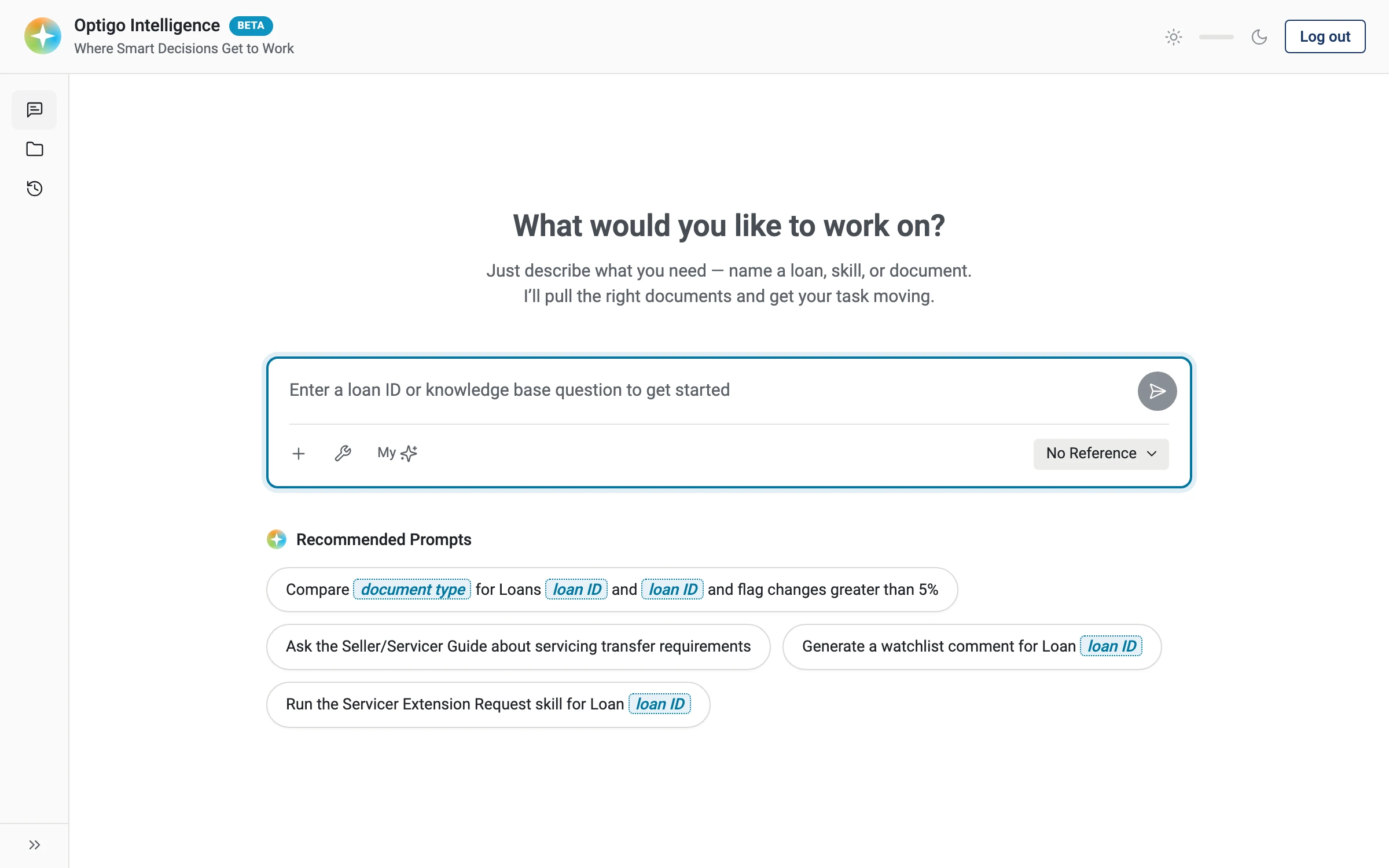
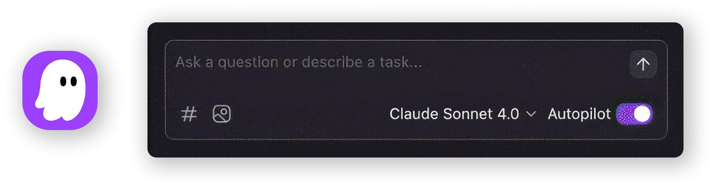
For this agentic-first approach, I proposed a chat input modeled after the ones in coding agents like Kiro. It seems like these toolbars at the bottom of chat inputs is becoming a common UX pattern in AI/agentic tools.
What’s next
In my view, the next biggest opportunity for this product is revisiting the loan-specific Skills UX. I think we’ll need a lot more research to deeply understand these workflows before we can solve for how to automate them with AI. There’s also a huge technical lift required here that the engineers are currently thinking through.
The other opportunity is chat history, which was deprioritized after the pilots. Right now, every chat is an ephemeral session. Nothing is retained, and the agent has no memory outside the chat you’re in. Working out that experience will be another huge lift, both UX- and tech-wise.
In short, this project is very much a work in progress. Like many companies we are trying to figure out how to effectively leverage AI for workflows like these.
The biggest lesson I learned
This team has been under so much pressure to deliver, on very short timelines with very limited resources - and in the totally new territory that is AI.
Working with them as design support, I’ve had to think like a product owner, too.
That means tailoring my UX recommendations to the needs of the moment, delivering quickly in code so developers can hit the ground running, and making strategic UX tradeoffs in the name of “today vs. tomorrow.”
Overall it’s been a great learning experience, and I’m excited to see how this project continues to evolve.
Work in progress
This is an ongoing initiative. More updates to come!