Building this portfolio with Claude Code
Playground / 2026
Like most designers, I was drawn to this field out of a deep desire to create. And in the last few years, AI coding tools have opened up a whole new world of creative opportunities. It feels like an exciting time to be someone with lots of ideas.
When I set out to make this portfolio, I wanted to treat it as a sort of exercise in building a site from scratch. While Claude helped with execution, I asked for the why behind what it was doing so I could actually learn from the experience.
But I also wanted this portfolio to be mine. Every design decision on this site, big or small, ultimately came from me. The writing on this site is my own (unless indicated otherwise, as you’ll see below). While I used AI nearly every step of the way, it still feels like this site is my creation.
As AI continues to evolve and change our ways of working, it’s important that we design, build, and use these tools in a way that keeps human ingenuity in the driver’s seat. AI shouldn’t be used to replace human creativity… but to supercharge it!
View design systemAI-generated content below
Below is a report, written by Claude, explaining the technical work & decisions behind the site.
Why Astro
The site started as plain HTML, which got painful by the fourth case study, so we talked through frameworks. Next.js is the industry default for web apps, but a portfolio isn’t an app, and shipping React to every visitor would be more than this site needs, at least for now.
Claude recommended Astro, a go-to for content sites like blogs and portfolios. It builds static HTML, ships almost no JavaScript, and can still add a React “island” if something ever needs to be interactive.
In practice, no framework code reaches the browser. Each page loads only small, hand-written scripts for what it actually does: the homepage gets one, and case studies add the lightbox.
- Content collections: each case study is one MDX file, checked against a Zod schema, so a missing title or alt text fails the build instead of shipping a broken page (hero images aside, where alt text is optional).
- One template: every case study renders through a shared layout and one dynamic route. This report is an MDX file too.
- Optimized images: responsive WebP at several widths via
srcset, plus a full-resolution WebP for the lightbox.
The migration had to look exactly the same afterward, so Claude Code compared every page before and after, on desktop and phone, pixel by pixel.
The design system as code
This site’s design system, galazio: γαλάζιο adj.Greek word for light or sky blue; sometimes translated as azure 💙, grew out of an earlier kit, Azure Arcade, made with Claude Design. We then rebuilt it in code on Tailwind CSS v4. Its tokens live in Tailwind’s @theme block with the defaults cleared, so only design system values exist. --color-ink in code matches color/ink in Figma, and components use semantic roles (action, link) rather than raw colors.
Ann Marie set the naming rule: keep her names where they work, follow industry standards where they apply, and if the two conflict, go with the standard and flag it for her. That’s how we landed on Tailwind’s standard type scale and a 4px spacing grid.
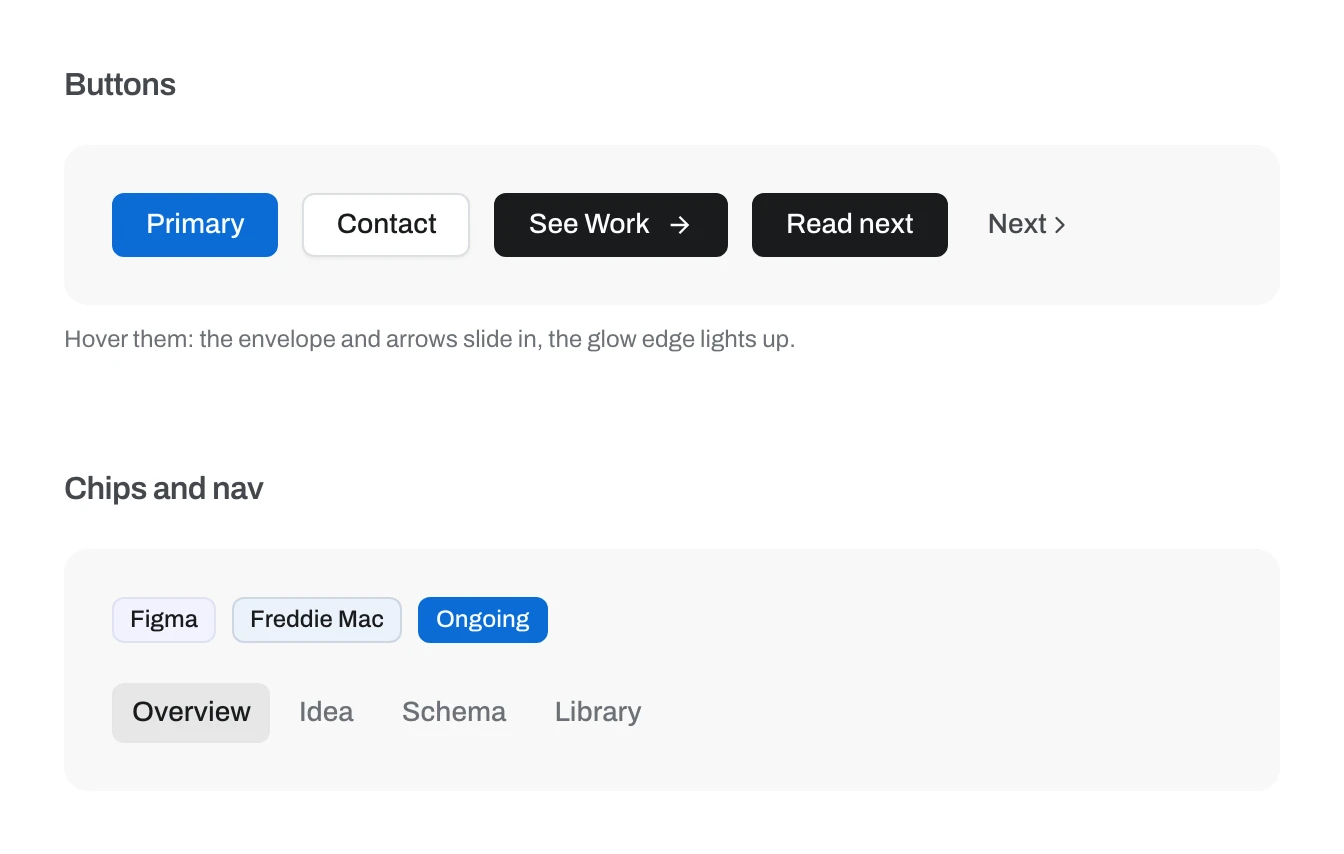
In late October we gave the whole site a shadcn-inspired polish pass: 6px corners, tinted chips, quieter section headings and a frosted case study header.
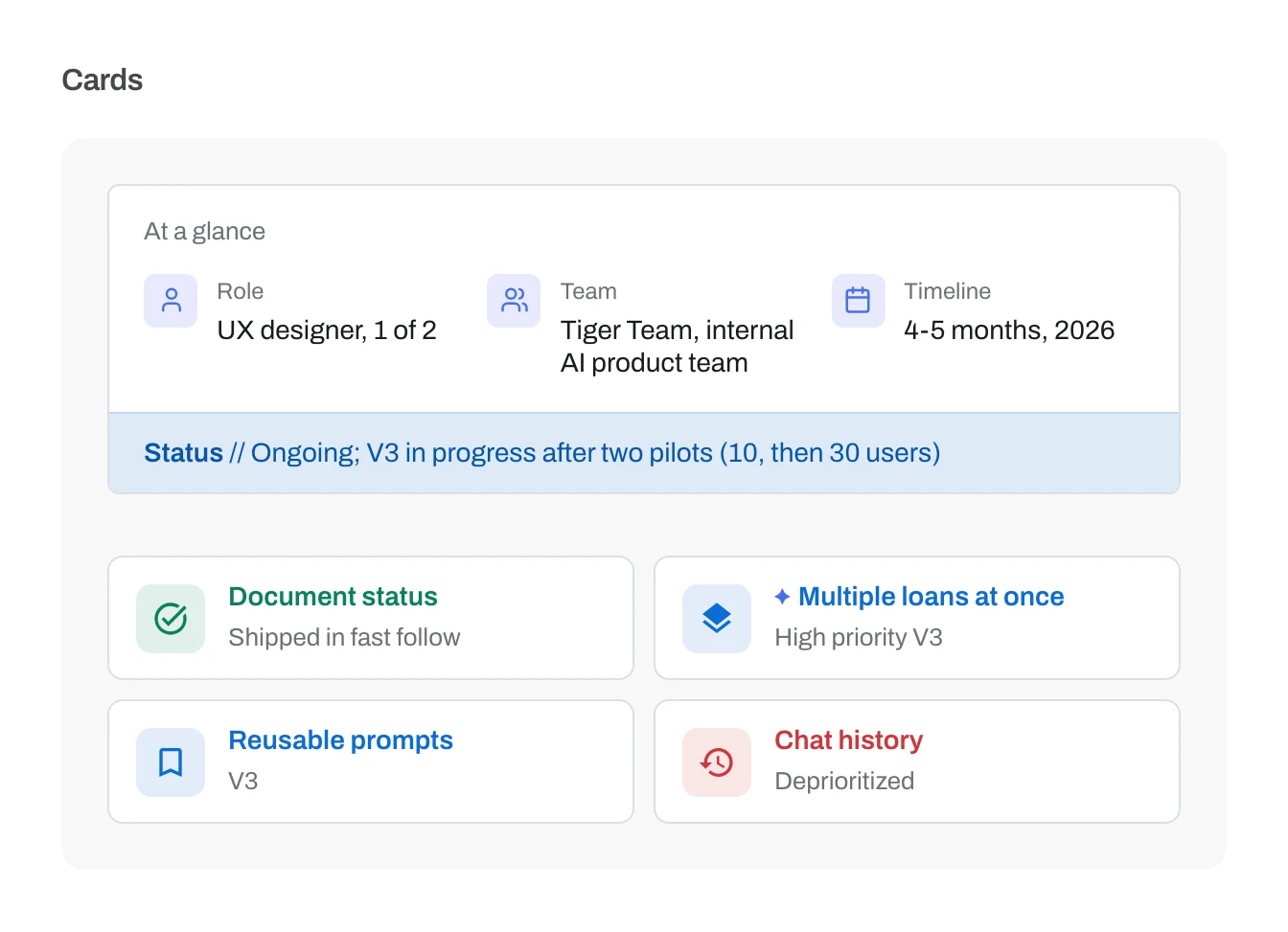
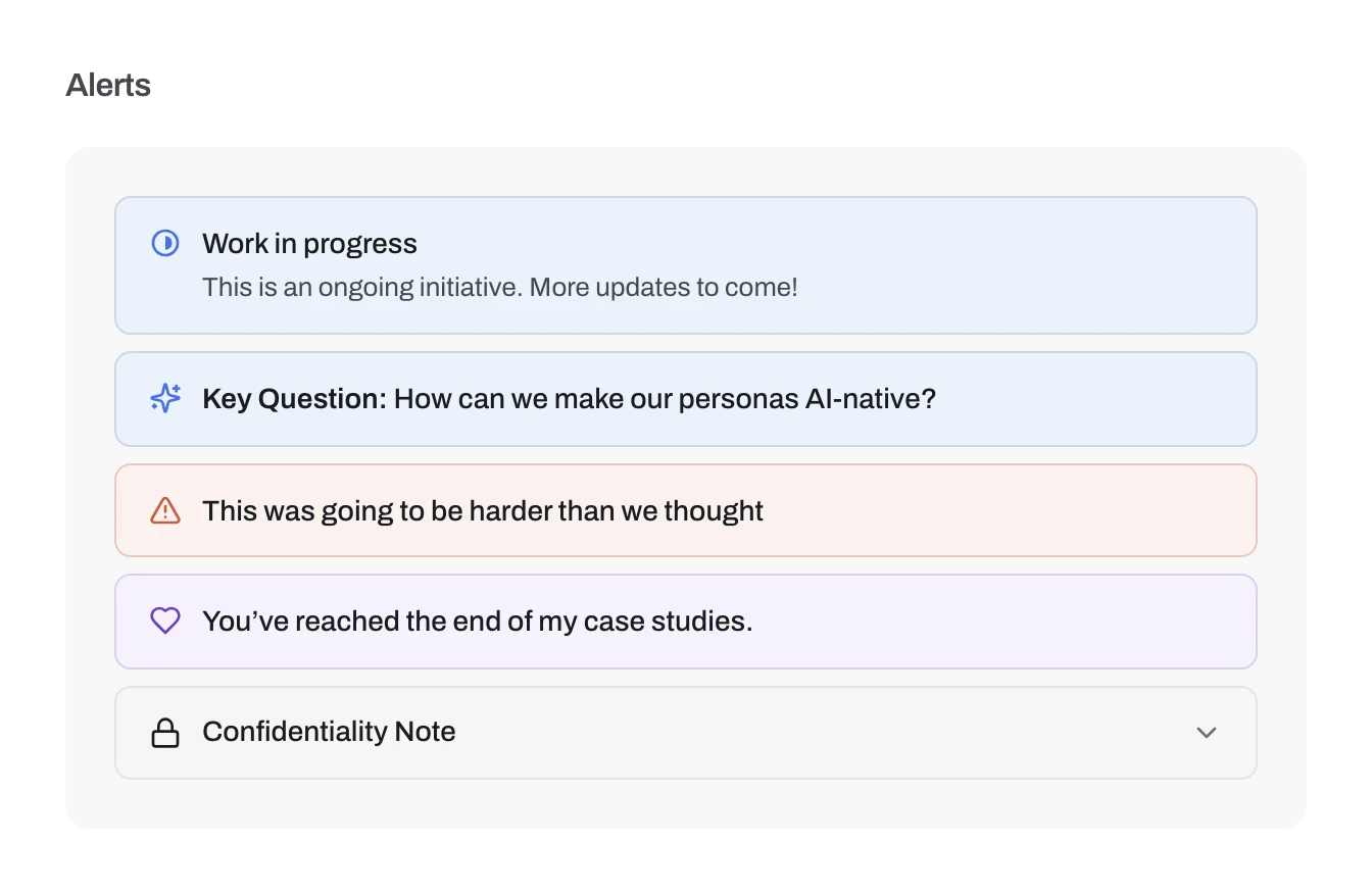
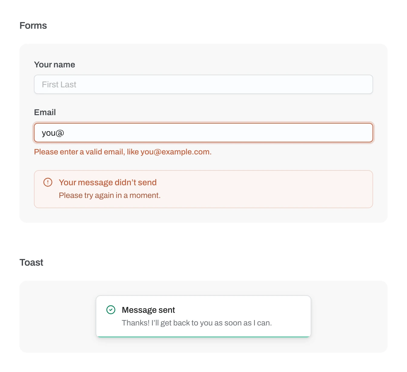
The design system renders the site’s tokens and components straight from the code. Colors, type sizes, corners and shadows are read out of the theme file at build time, so it can’t drift out of date. The screenshots below come from it.
Figma and code, both directions
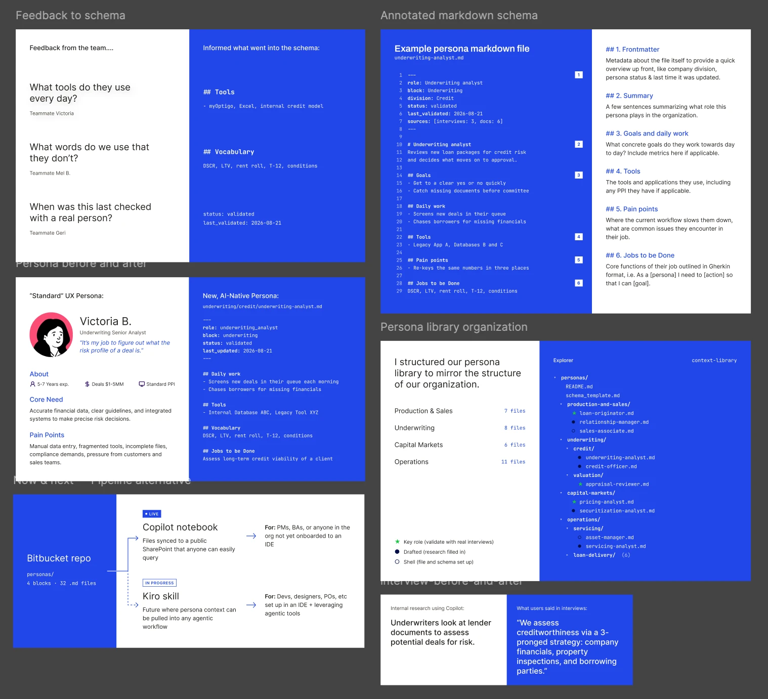
The Personas case study figures started out built in code, which made them hard to edit. Using the Figma MCP, Claude rebuilt them as Figma frames on the design system’s variables. Ann Marie made her edits by hand on the canvas, and the frames came back to the site as 2x exports. Code to canvas and back again.
Interaction details
The small things took the most back and forth.
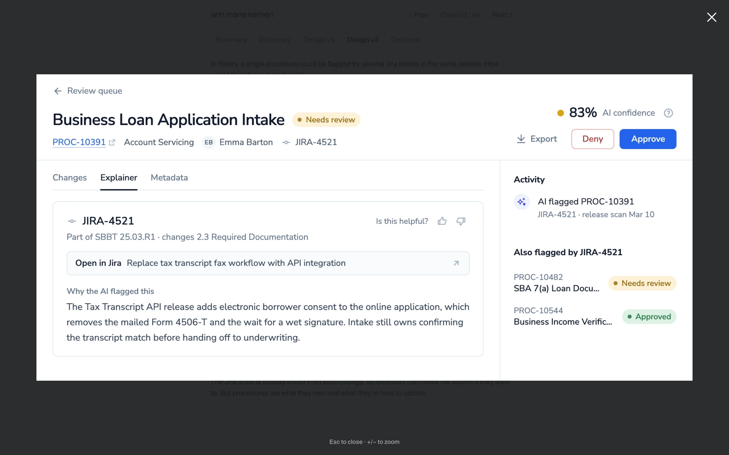
The lightbox uses a native <dialog>, so focus handling and Escape come built in. Each image grows out of its spot on the page and shrinks back into it on close. Pinch, click or +/– zooms; a swipe or the arrow keys move through a set; and the full-size original starts downloading as soon as someone hovers, so it’s usually sharp by the time it opens.
All of it is about 560 lines of plain JavaScript, around 7 KB compressed, with no library behind it, including fixes for a few iOS Safari quirks.
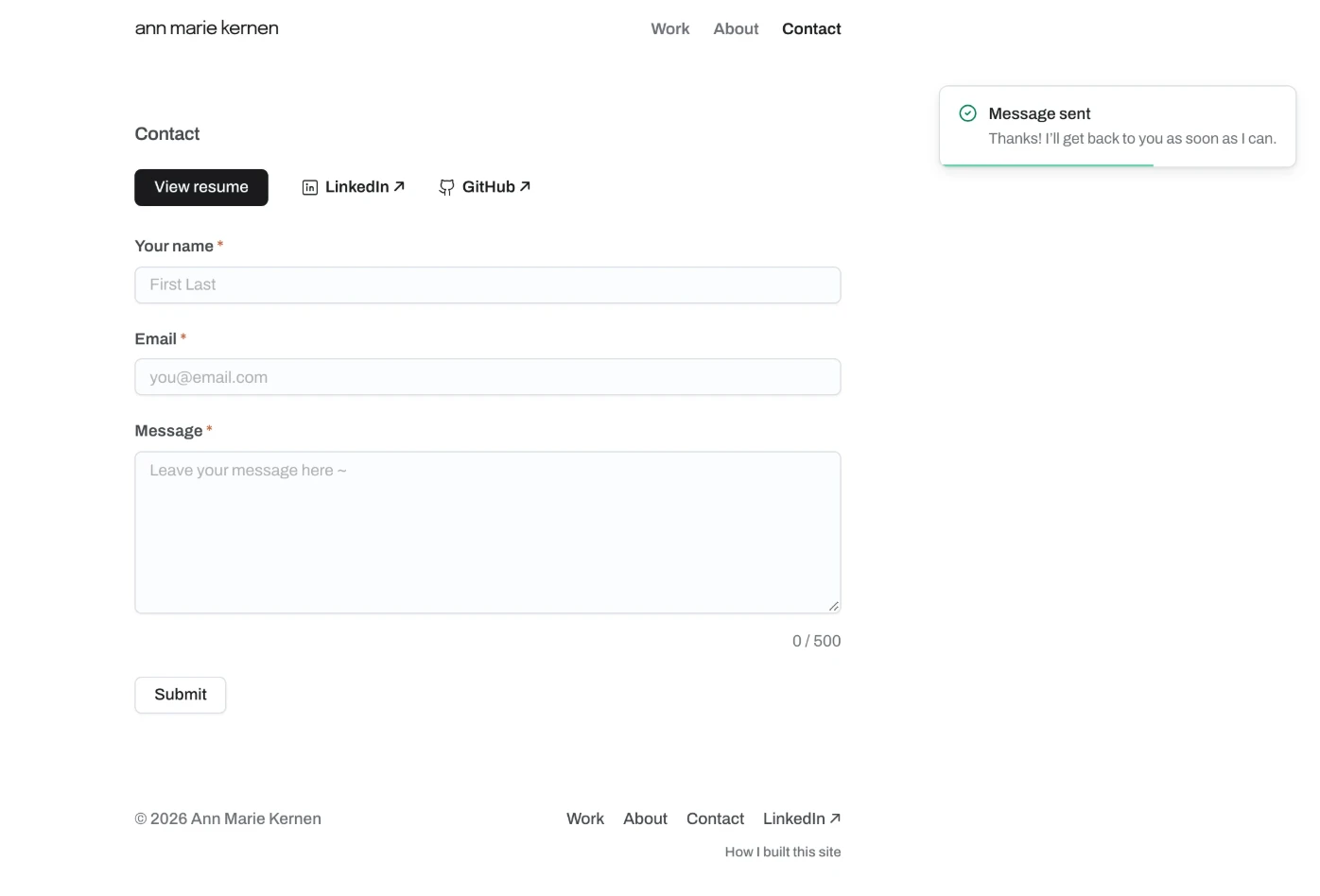
The contact form runs on a Cloudflare Worker that emails each message to Ann Marie through Cloudflare Email Routing. A hidden honeypot and Cloudflare Turnstile keep bots out, errors show inline and are announced to screen readers, and drafts are saved to sessionStorage, so a reload doesn’t lose a half-written message. For the toast, Claude researched how established libraries animate theirs, and we borrowed react-hot-toast’s easing curve.
Accessibility
Every animation on the site has a reduced-motion fallback: the homepage gradient and typing intro, the scroll reveals, carousels, videos and the lightbox all hold still for anyone who’s asked their device for less motion.
Images open in the lightbox from the keyboard too (Enter or Space), and focus goes back to the image when it closes. And since the build checks for alt text, every image that carries meaning has a description.
ARIA follows its own first rule: native HTML first (<dialog>, <details>, <button>), and ARIA only where HTML can’t say it. That means aria-label on icon-only buttons like the carousel arrows, live regions so the toast, error banner and character count get read out, aria-describedby and aria-invalid to tie each contact field to its error, and aria-hidden on purely decorative icons so screen readers skip them.