Procedures Updater
For this project I lead discovery and UX design for an AI-powered tool to automate a repetitive, time-consuming enterprise task.
Confidentiality Note
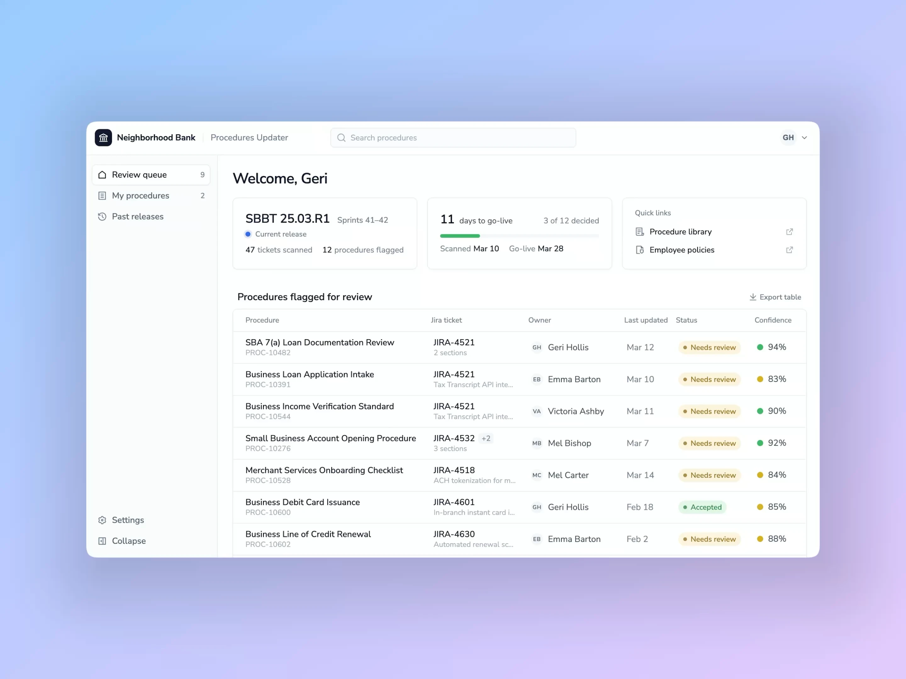
This was proprietary internal work at a financial institution. Every screen below is a faithful recreation rebuilt from memory and notes, and all names, loans and data shown are fictional and non-confidential.
Problem
8–10 hours wasted per week, per change management employee.
At Wells Fargo, every job function had to be documented in a formal procedure. Our change management teammates were responsible for keeping up with tech changes that might impact those procedures, and updating them if/when they did.
The problem was there was no easy way to monitor for these changes. They had to sit through every tech release call, sometimes for hours, to catch any possible changes.
When AI tools first started rolling out at the bank, leadership came to our team and asked if we could automate this entire process. We said, sure, why not!
Discovery
My manager and I led the discovery process for this request. Together we held close to a dozen informal discovery conversations, including people from change management, internal policy teams, and others.
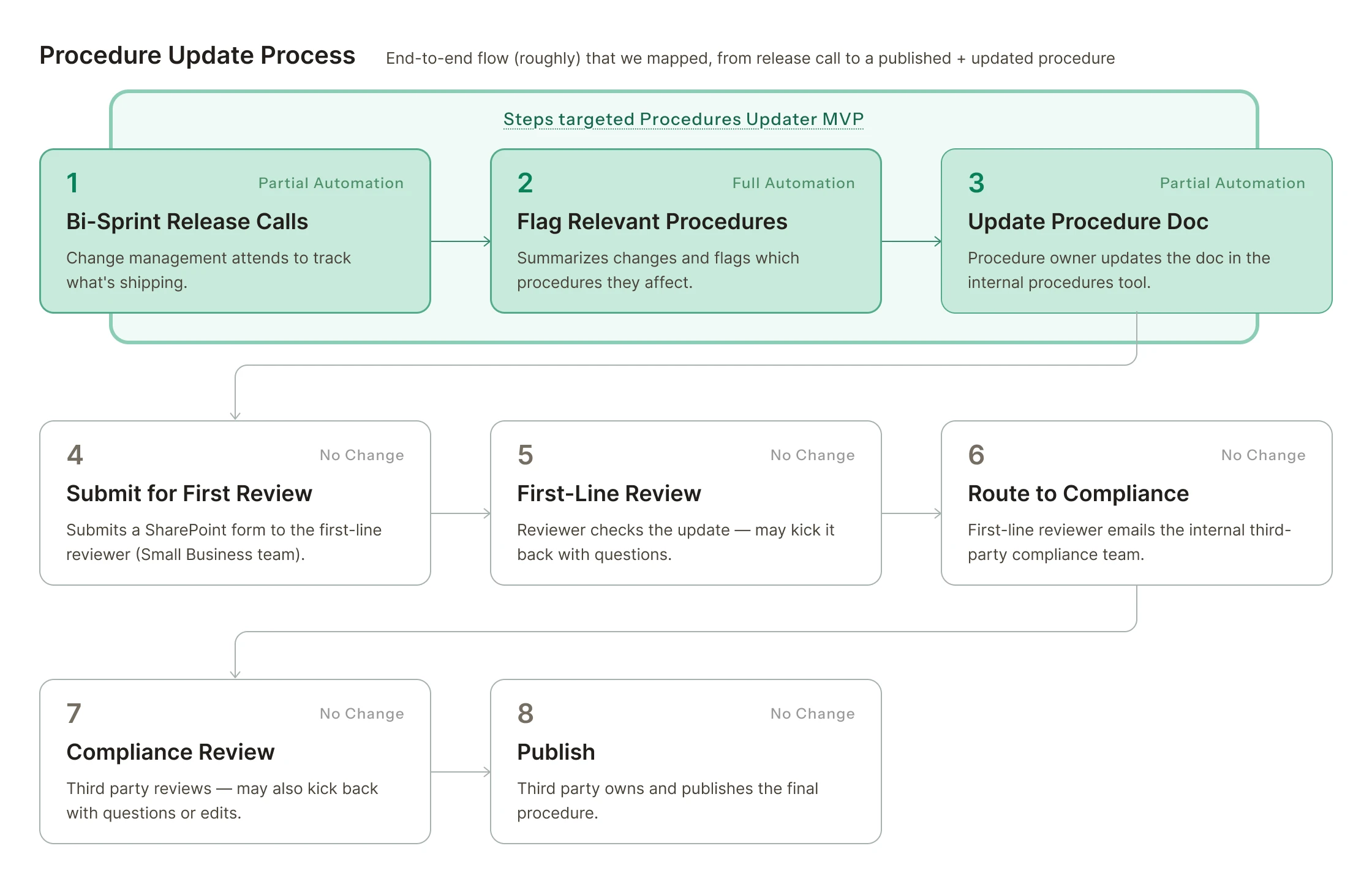
In our conversations we also realized… no single person knew what the entire end-to-end process was. They just knew what their team was responsible for. So mapping the process ended up being an entire effort in and of itself.
To summarize, our key takeaways were:
- BureaucracyThe approval chain was more layered and regulated than we realized
- Mid-migrationThe legacy procedures tool was mid-migration to a new platform
- DisconnectedThe whole process touched a bunch of systems that didn't talk to each other
- ComplexityThis was going to be harder than we thought 😅
Given everything we learned in discovery, it seemed automating the full process wasn’t realistic or strategic…
I argued the UX scope should be narrowed down to what we could actually move: the monitoring & alerting layer. Let’s build something that catches changes early, routes them to the right person, and uses AI to give users something actionable. Keep the downstream processes as-is, since they’re pretty out of our control anyway.
Design v1
With our process more or less mapped, our user pain points understood, and our project scoped, it was time to start putting together a prototype to validate. Aka the fun part!
I had the idea in my head that it would be like a dashboard landing page, with each line item being a procedure that had been flagged for review by AI.
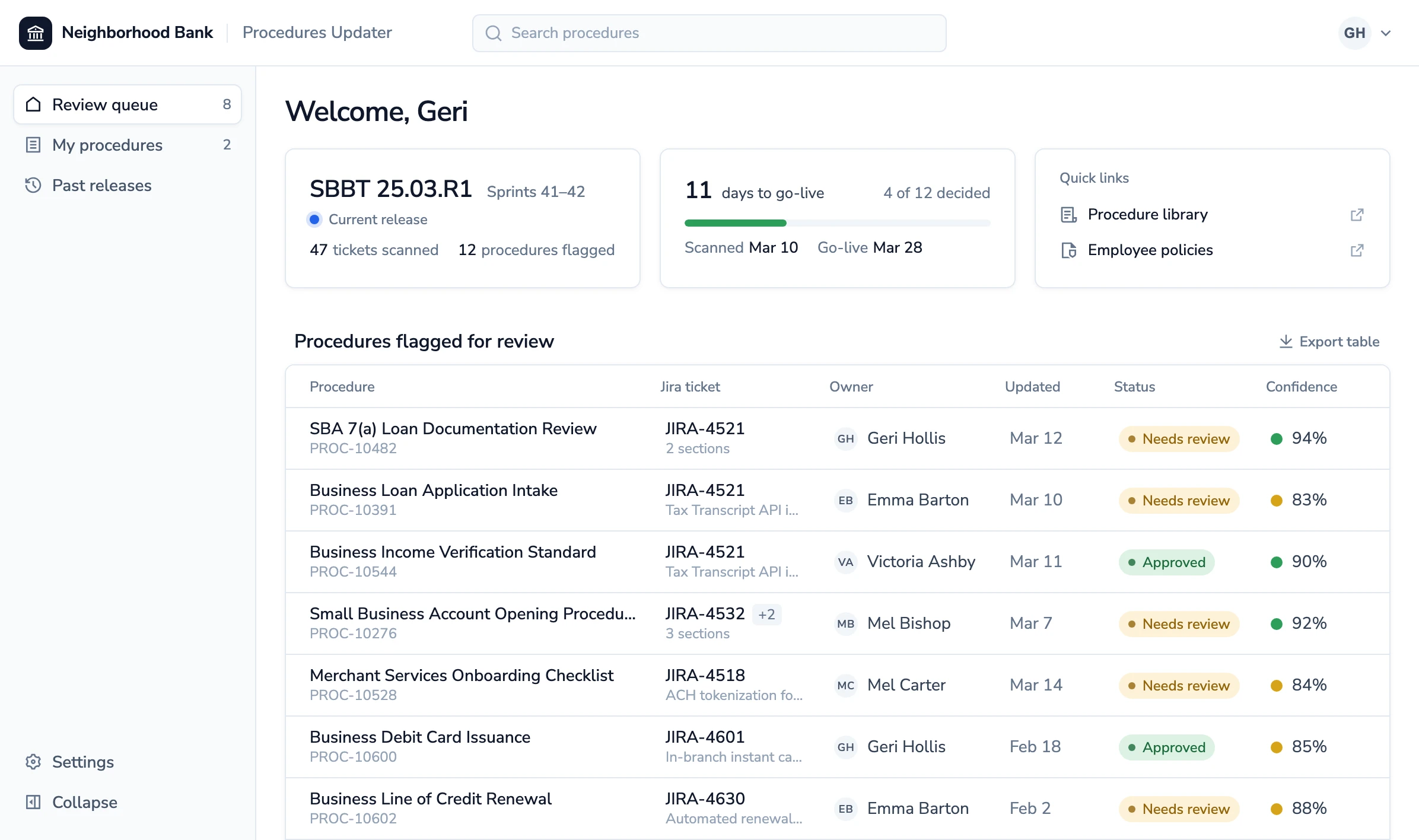
Clicking into the line item would take you to a detailed view, showing key info about the procedure, plus what the AI recommended to change and why.
The Review
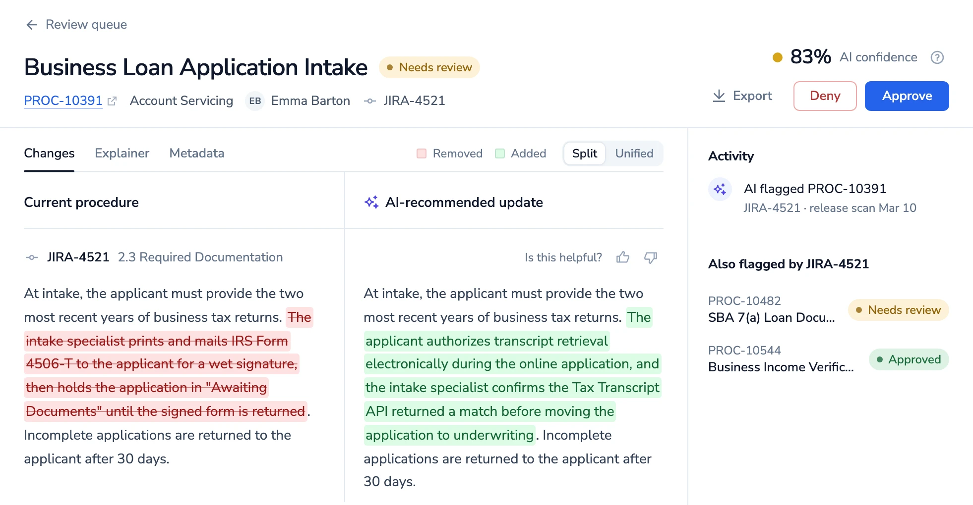
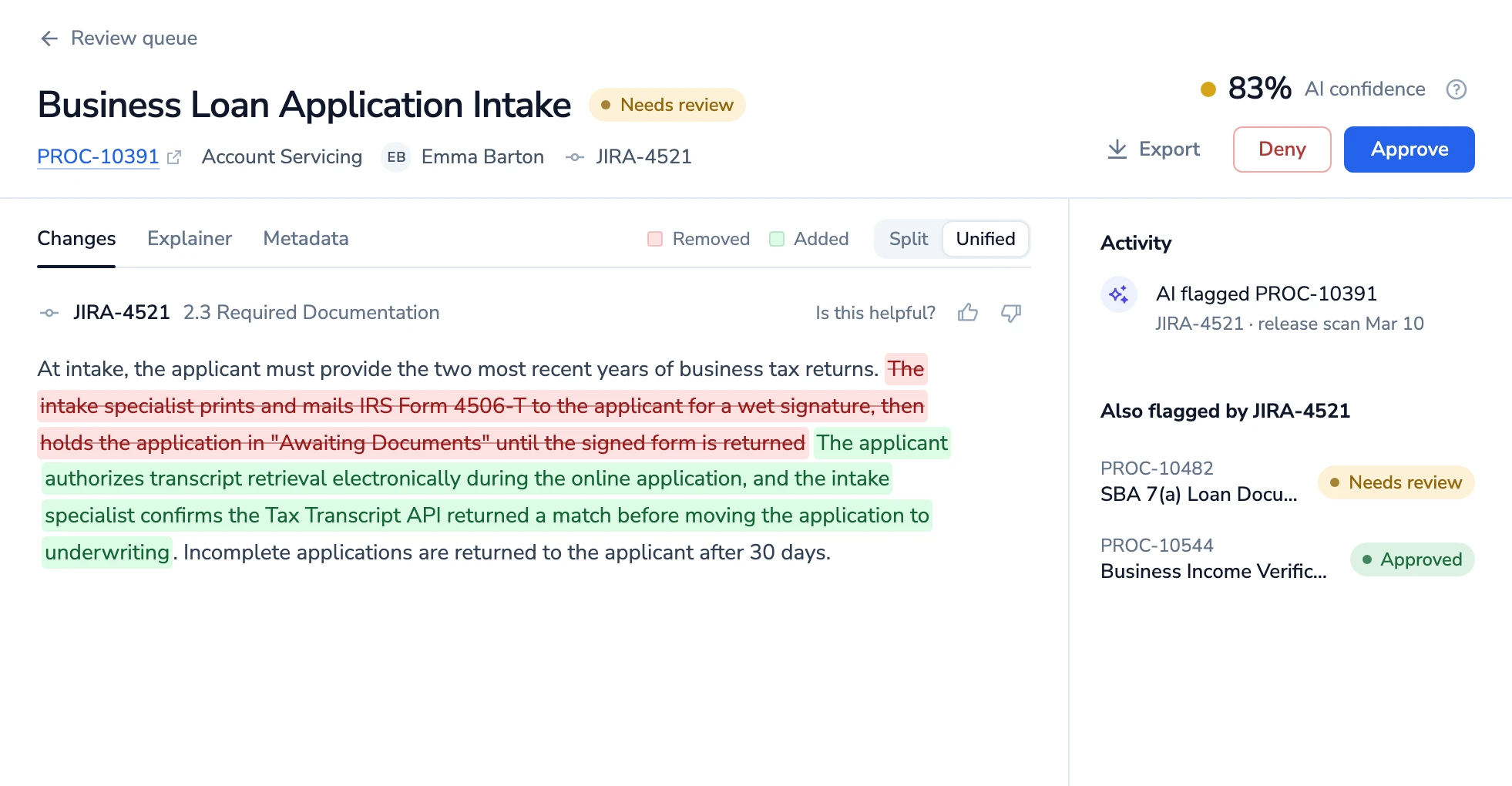
The detailed view shows a side-by-side diff, with removals in red strikethrough and AI-recommended additions highlighted green. There’s an option to see it separated by before/after, or all inline together.
AI Confidence
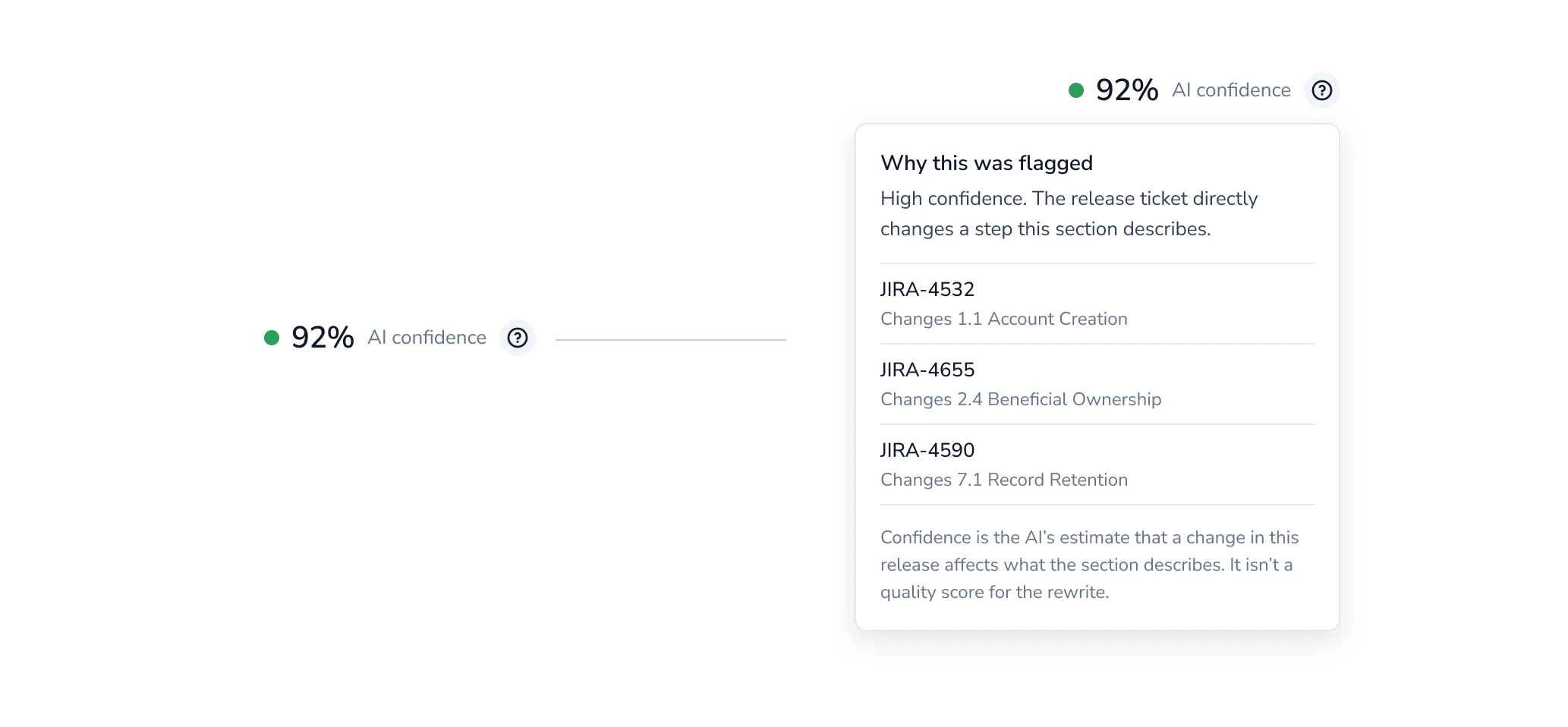
Every flagged procedure carries a confidence score, which is the AI’s accuracy estimate that a tech change impacts what the procedure describes.
The confidence score was a small idea I had that ended up being really appreciated by stakeholders. Since AI was still quite new at the time, I think they appreciated the transparency.
Approve and share
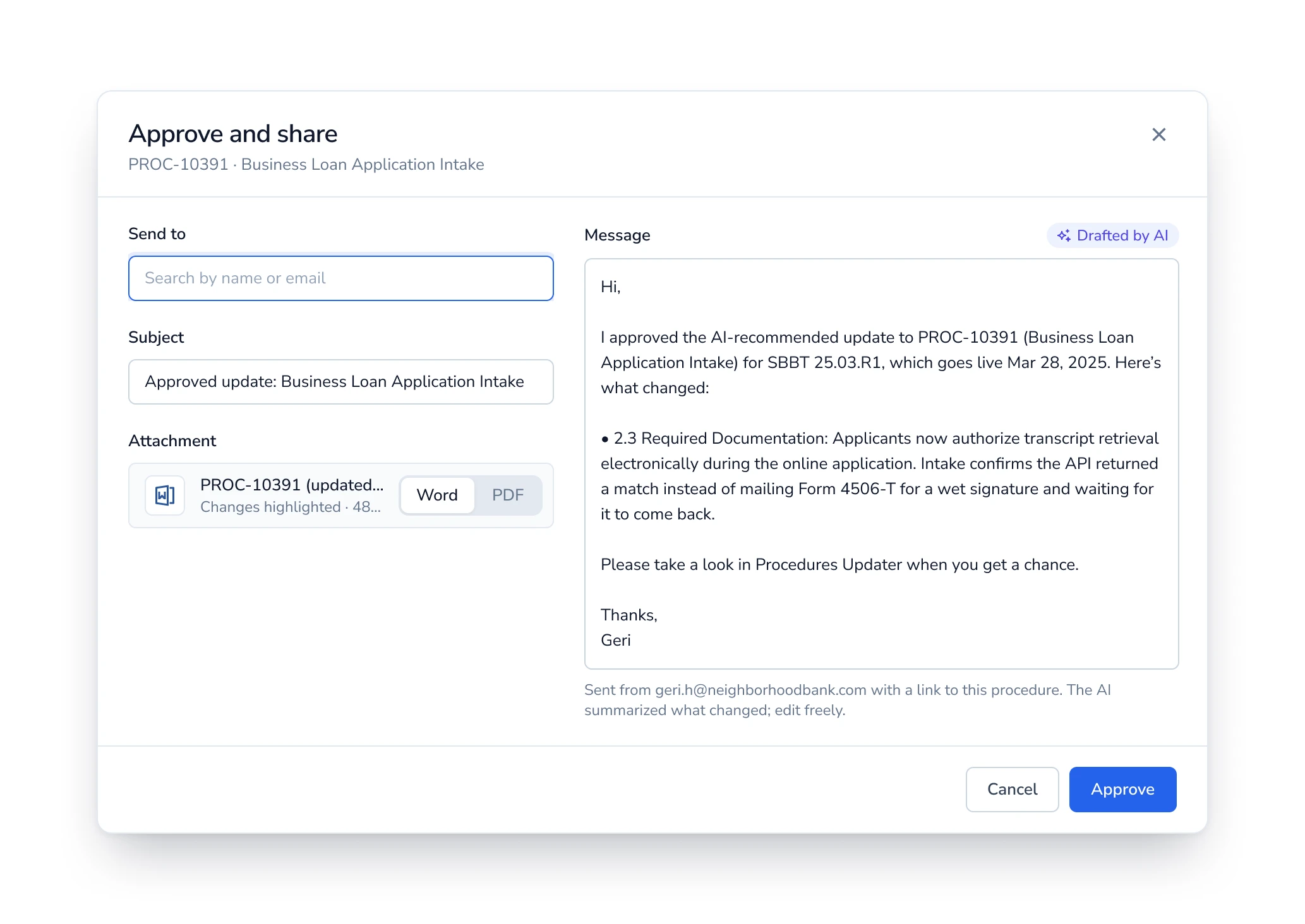
After reviewing a procedure, users can kick off an email to whoever needs to know. The updated procedure could be attached as a Word or PDF file with changes highlighted. There would also be an AI-drafted summary of what changed, which the reviewer could edit before sending.
Design v2
Once the first mockup version was complete, I shared it around with the team, including my manager, engineers, and some change management folks. Feedback was really positive!
Our 2nd iteration was mainly dedicated to some edge cases our engineers identified, and figuring out how we’d design for them.
Edge case #1: one procedure, many tickets?
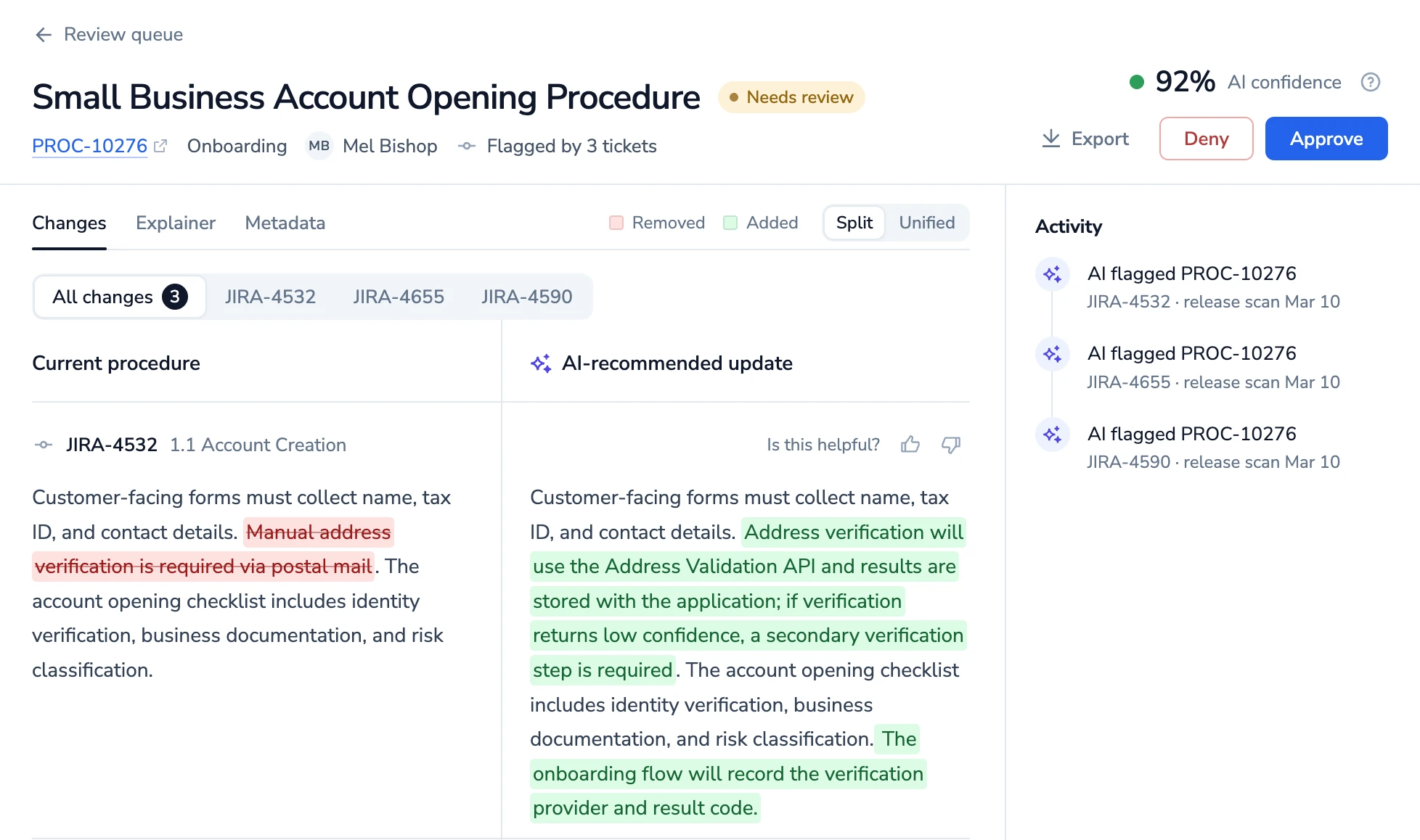
In theory, a single procedure could be flagged by several Jira tickets in the same release. How would that show up on the UI?
We went with a secondary nav menu under the Changes tab, that lets reviewers see all changes at once, or filter by ticket.
Edge case #2: one ticket, many procedures?
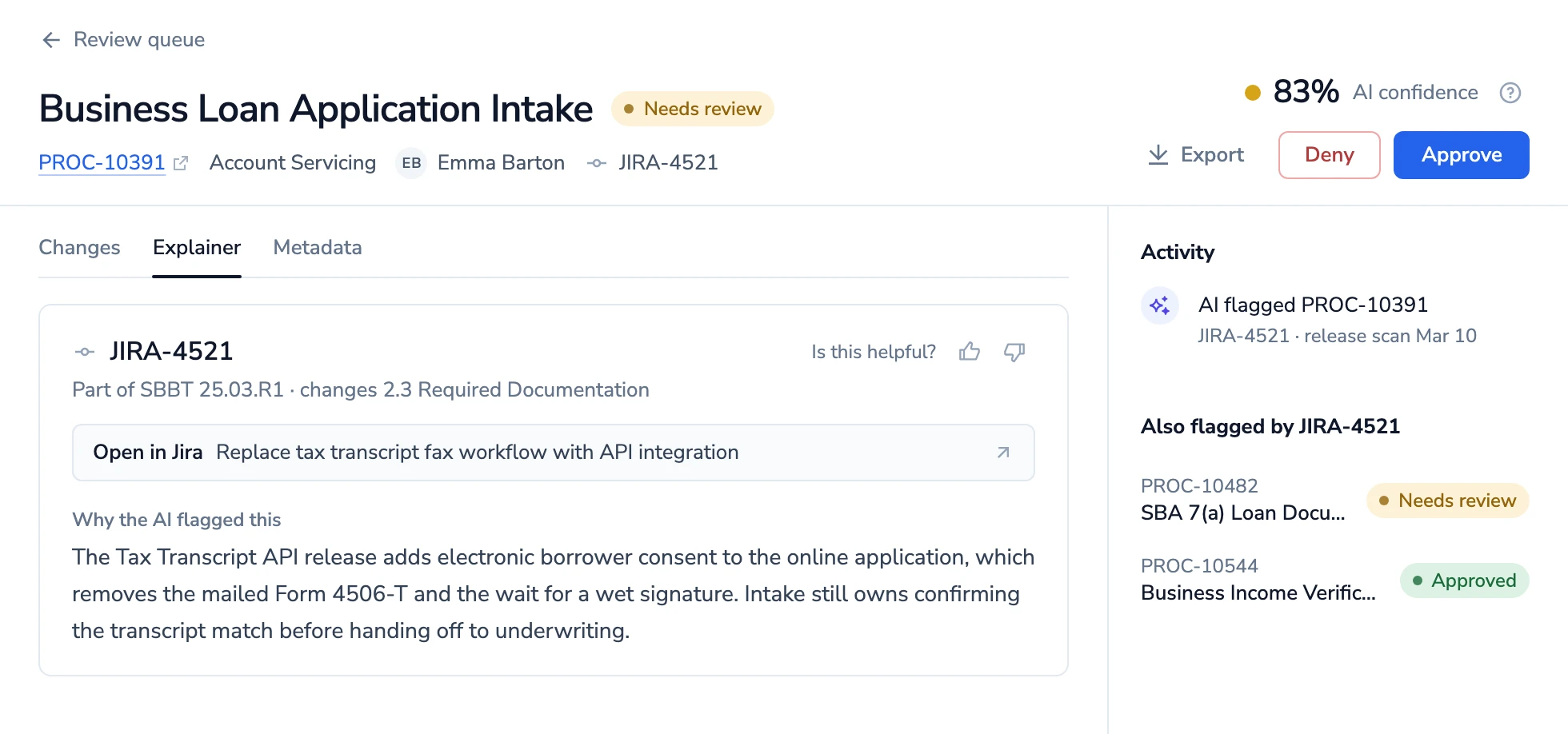
Similar but opposite to the last one - one Jira ticket could also touch several procedures. How should the UI call that out?
For MVP, we decided that basically…it didn’t need to. The design assumption was that users would be thinking at the procedures level, not about tech tickets.
The Jira ticket is already linked from each change, so reviewers can check the source if they want to. But procedures are what they own and what they’re here to update.
Outcome + Next Steps
The engineers ended up using screenshots of my mockups to upload to Github Copilot. This cut down their development time, by their estimates, from 2 weeks to under 3 days.
In late 2026, stuff like this is table stakes. But at the time it was totally new to the organization, and was seen as a huge win!
Next Steps
I ended up leaving the company before getting to see through version 2 post-MVP. Here are some things I’d recommend if we had more time and resources.
Flesh out edge case 2 - one ticket, many procedures
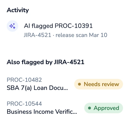
If we had more time in the project, I’d recommend something like this so users could, if they wanted to, easily see what other procedures were impacted by the same tech change. But this was not in scope for MVP.
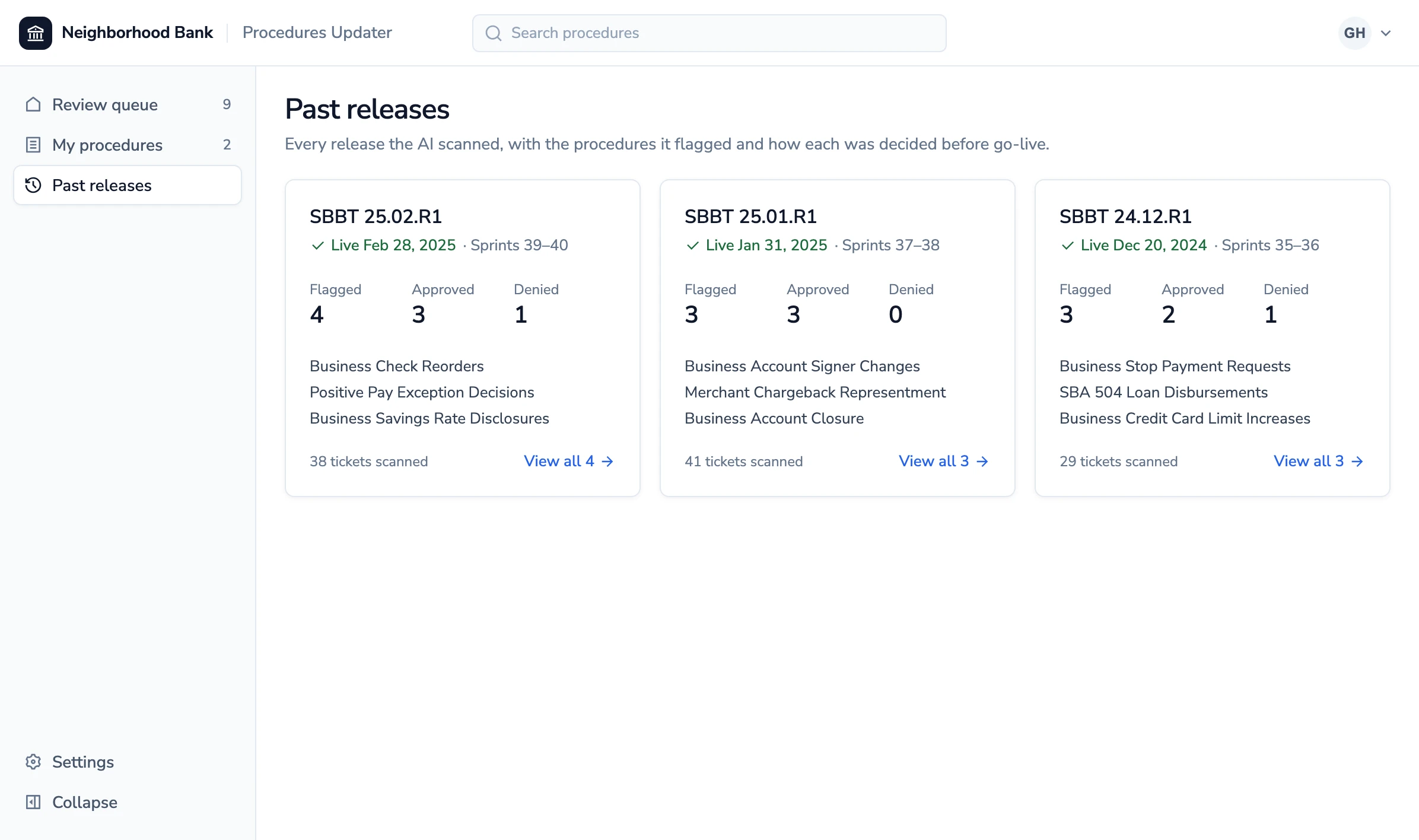
Historical view of past tech releases
Landing page for just “your” procedures
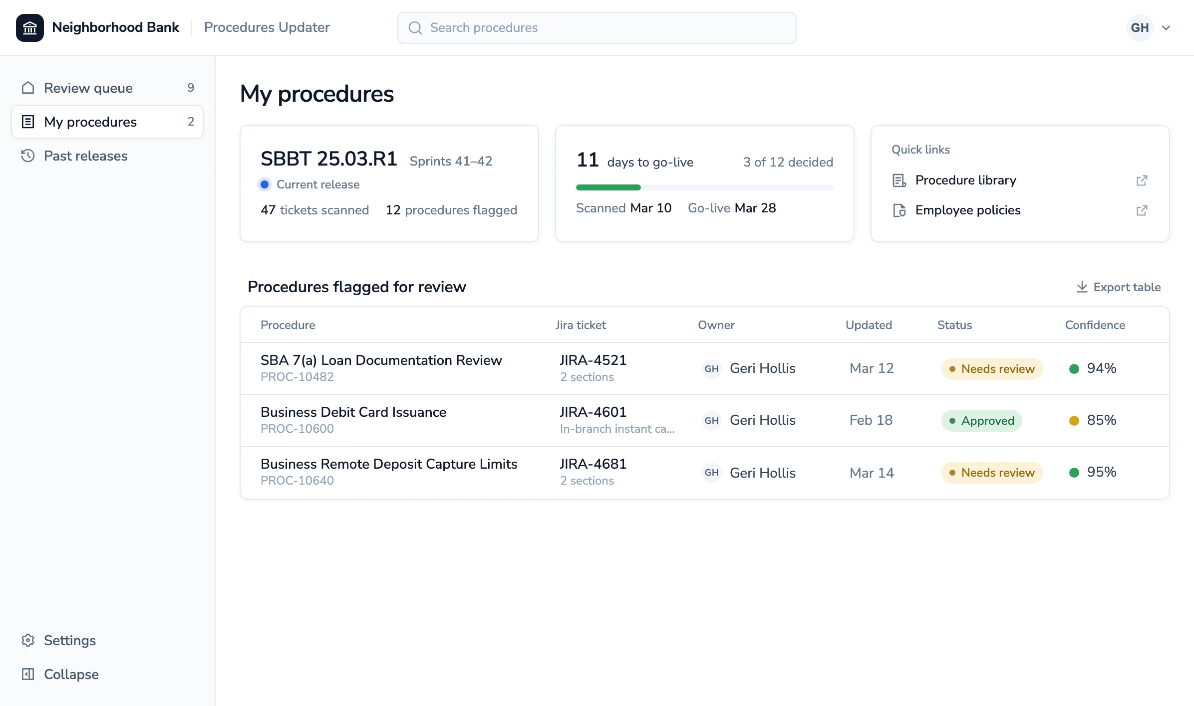
Some other things that were slated for after MVP included:
- Rich text editing capabilities
- Feedback loop UX for AI training
- Tracking/reporting for management