PLANR: A Public Transit Planning App
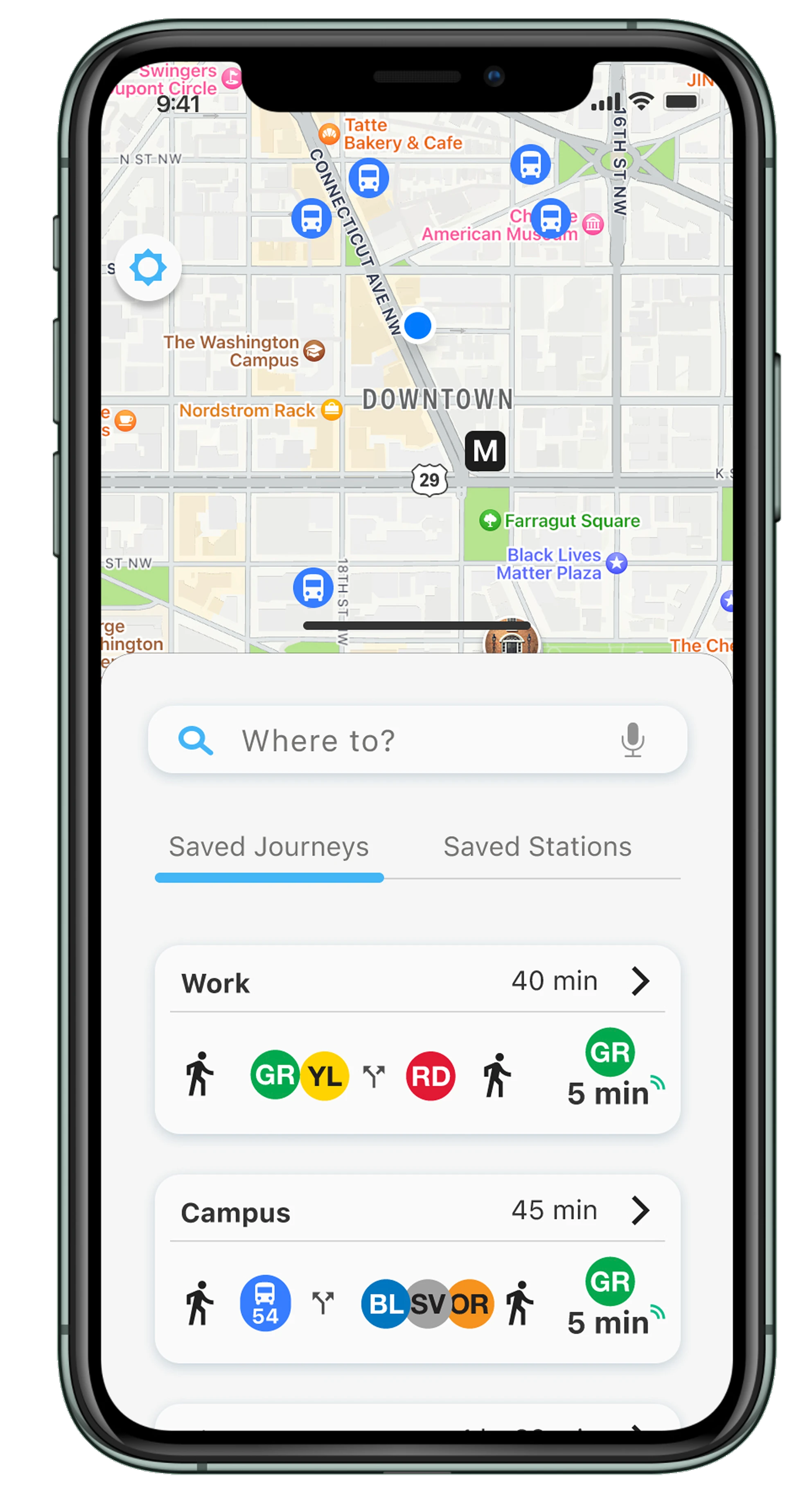
A prototype iOS app that helps DC commuters plan, save, and navigate public transit journeys. This was my capstone project at Springboard - it was my first ever end-to-end UX prototype, and has a special place in my heart 💙
Research
Our first task for this project was to research a problem we were interested in solving. I knew I wanted to do something around public transportation, inspired by the less-than-ideal UX of our city’s local transit app. My idea was to make some sort of transit payment app (this was before we could add our metro cards to a digital wallet).
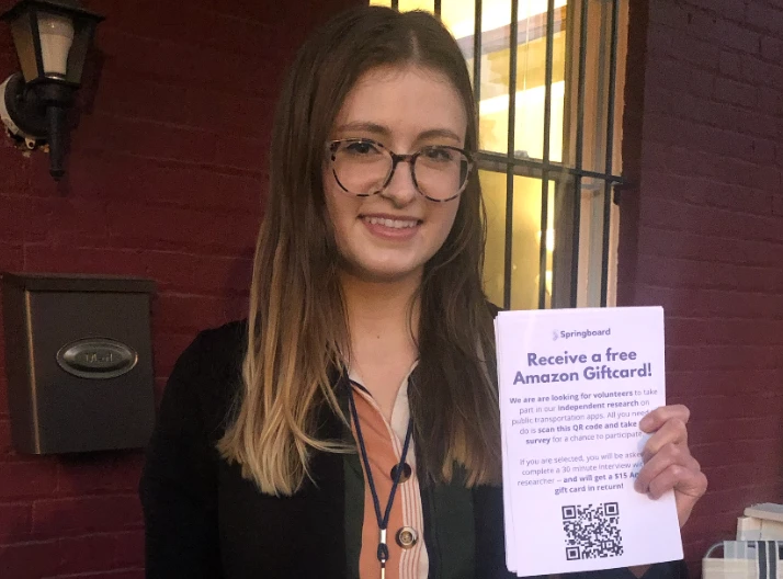
Recruiting at the metro
This may have been a Bootcamp project, but I was determined to take it seriously, lol! I actually went and handed out flyers at the local metro station, asking people to participate in my “research study.” In total 7 people signed up to participate, and all received a $15 Amazon gift card as a thank you 😄
Affinity mapping the interview notes
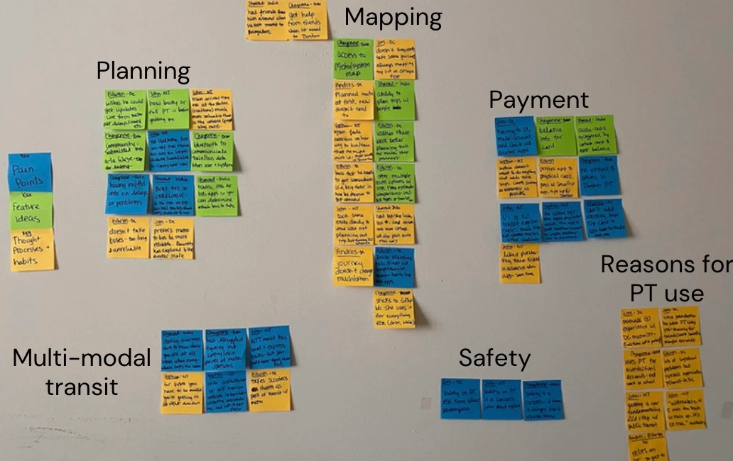
This wouldn’t be a UX portfolio without a wall of sticky notes, now would it? 😆
3.5 hours of interview recordings and 18 pages of notes later… It was clear that planning kept coming up as a core pain point for the people I interviewed.
As regular riders, their payment method was already set up. They generally knew the stations, routes, and how to get from A to B. But what they often didn’t know was the right time to leave.
Translating findings into personas
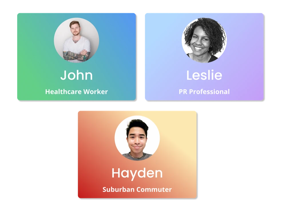
From the 7 people I talked to, I estimated there were 3 key personas I’d have to design for:
- Frequent, high-stakes riders (i.e., strictly in-person workers who rely on transit to get to work)
- Frequent, low-stakes riders (i.e., people with flexible/remote jobs who still rely on transit to get around)
- Suburban commuters (i.e., riders who take less frequent but longer trips, and have less room for error)
“I commute into the city 3 times a week for college classes. If I miss a train, the next one might not come for another 40 minutes!”
-Quote from a ‘Suburban Commuter’ I interviewed with
Sketches to wireframes
Because planning came up so consistently as an issue, I scrapped the metro payments app idea altogether. Instead, I wanted to focus on an app that helped users save the journeys they took the most, allowing them to easily check transit schedules & plan their day accordingly.
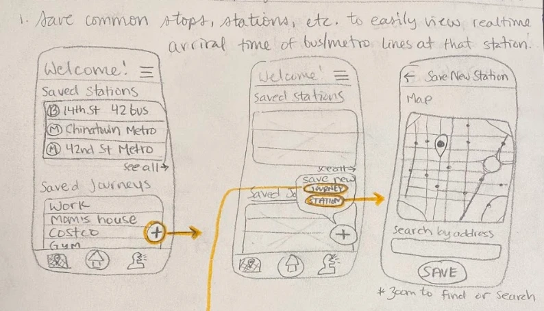
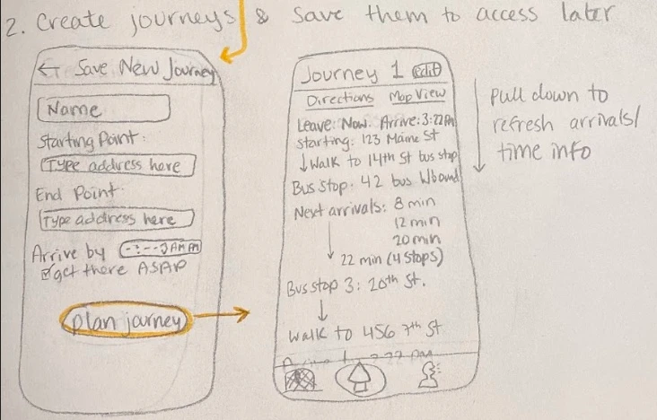
Round one: sketches on paper
The very first sketches working out the core screens: saved stations, saved journeys, creating a new journey.
Round two: sketches on fancier grid paper!
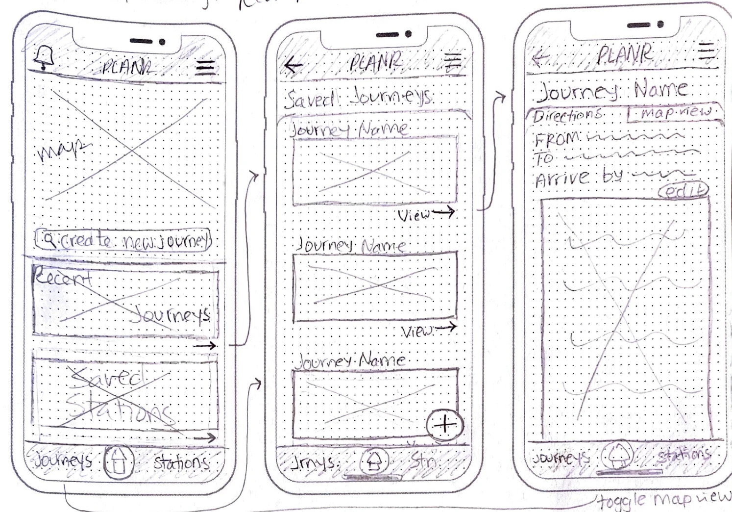
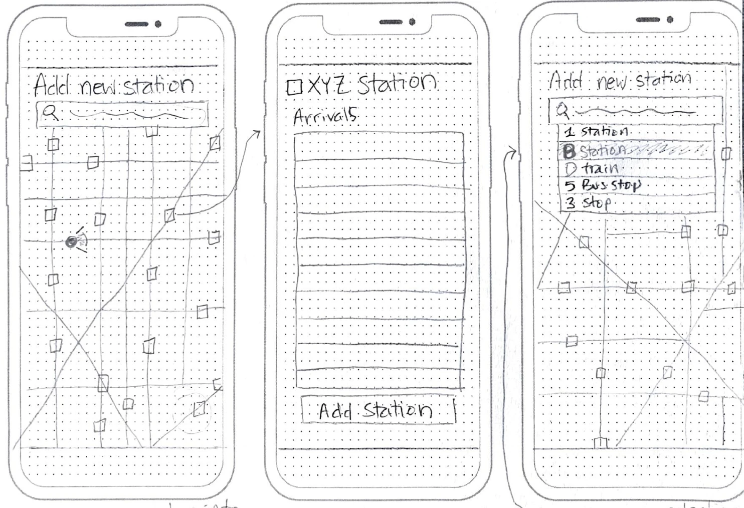
Second pass on much nicer grid paper - this time, the home screen was a map view with a lower drawer, a-la Uber or Lyft. A user could tap into saved journeys / stations, or kick off a new trip right there.
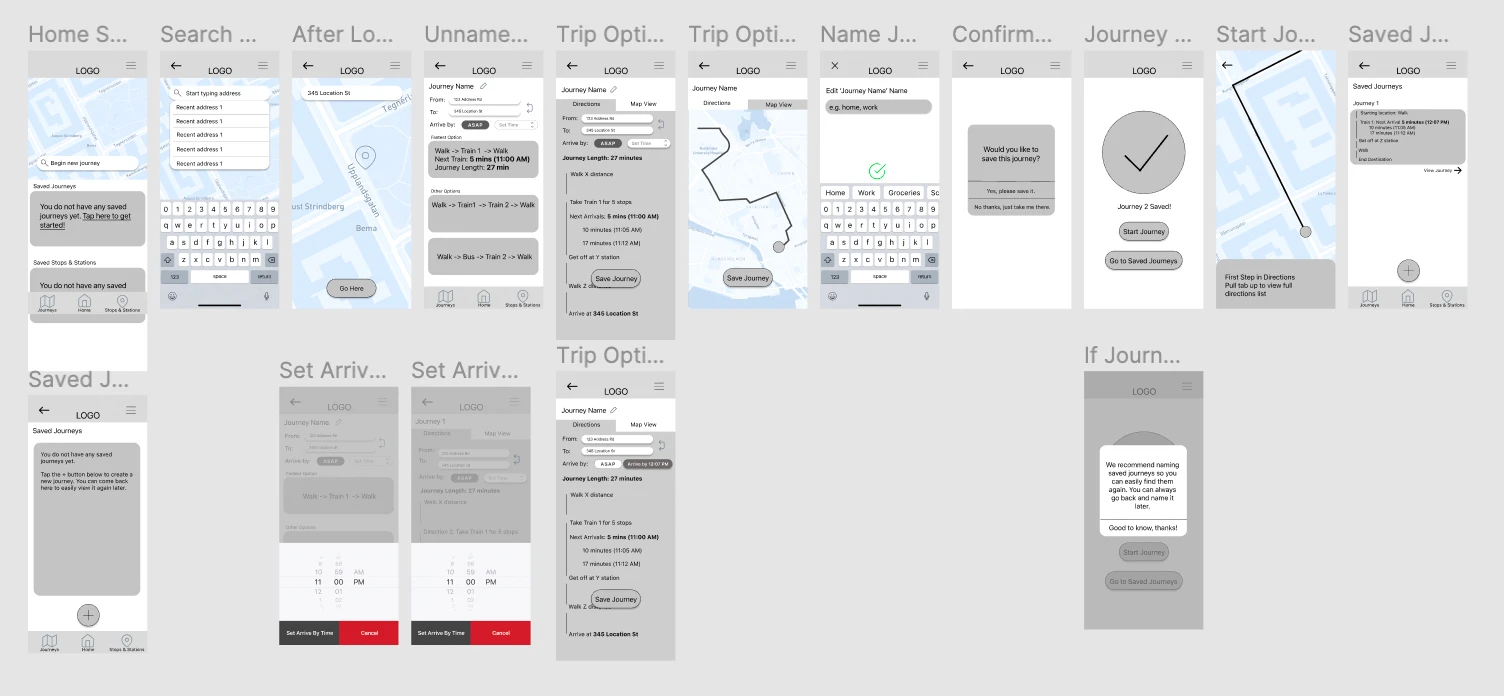
Wireframes, digitized
Once the core flows felt right on paper, I rebuilt them in Figma in a greyscale wireframe.
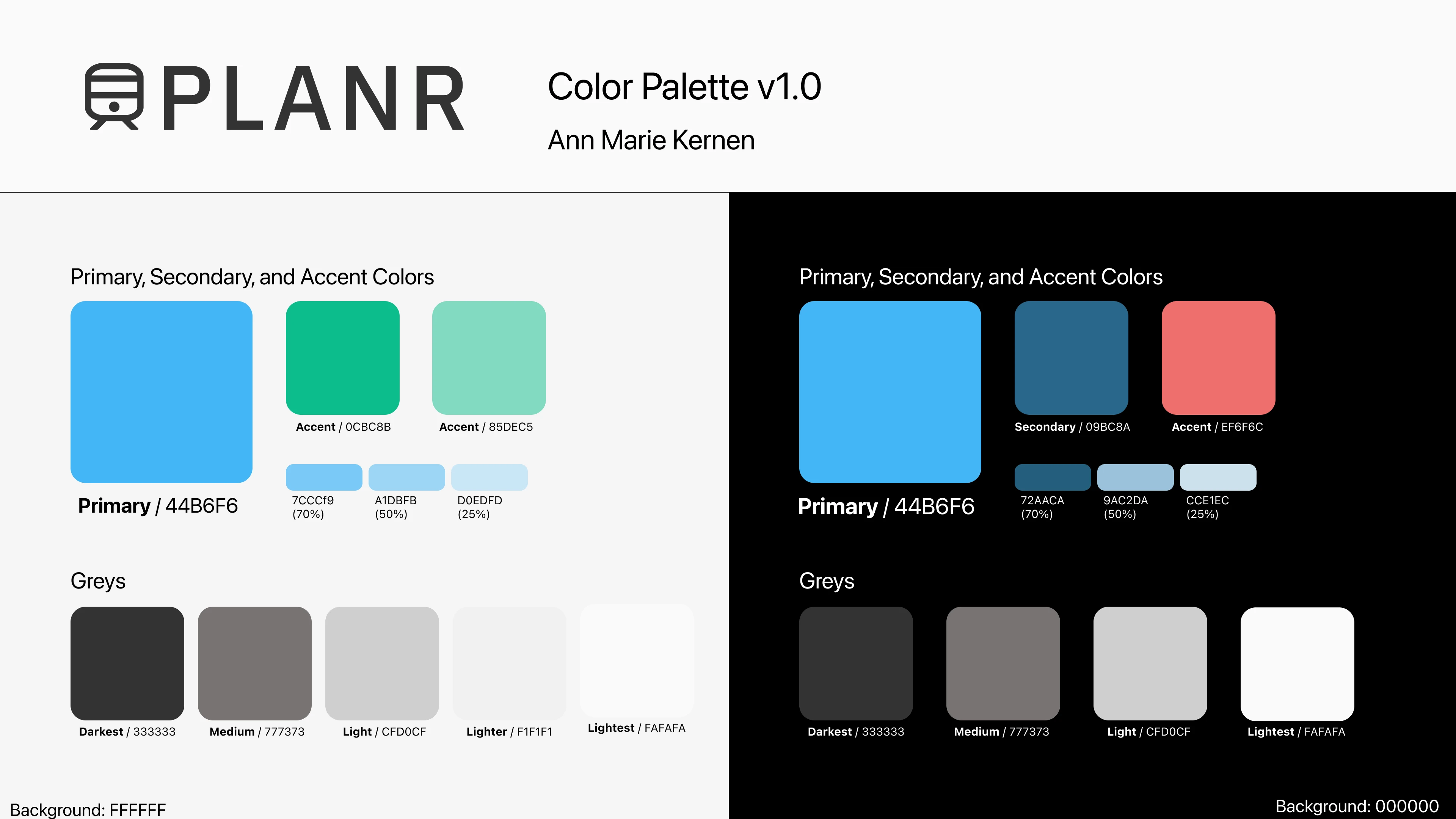
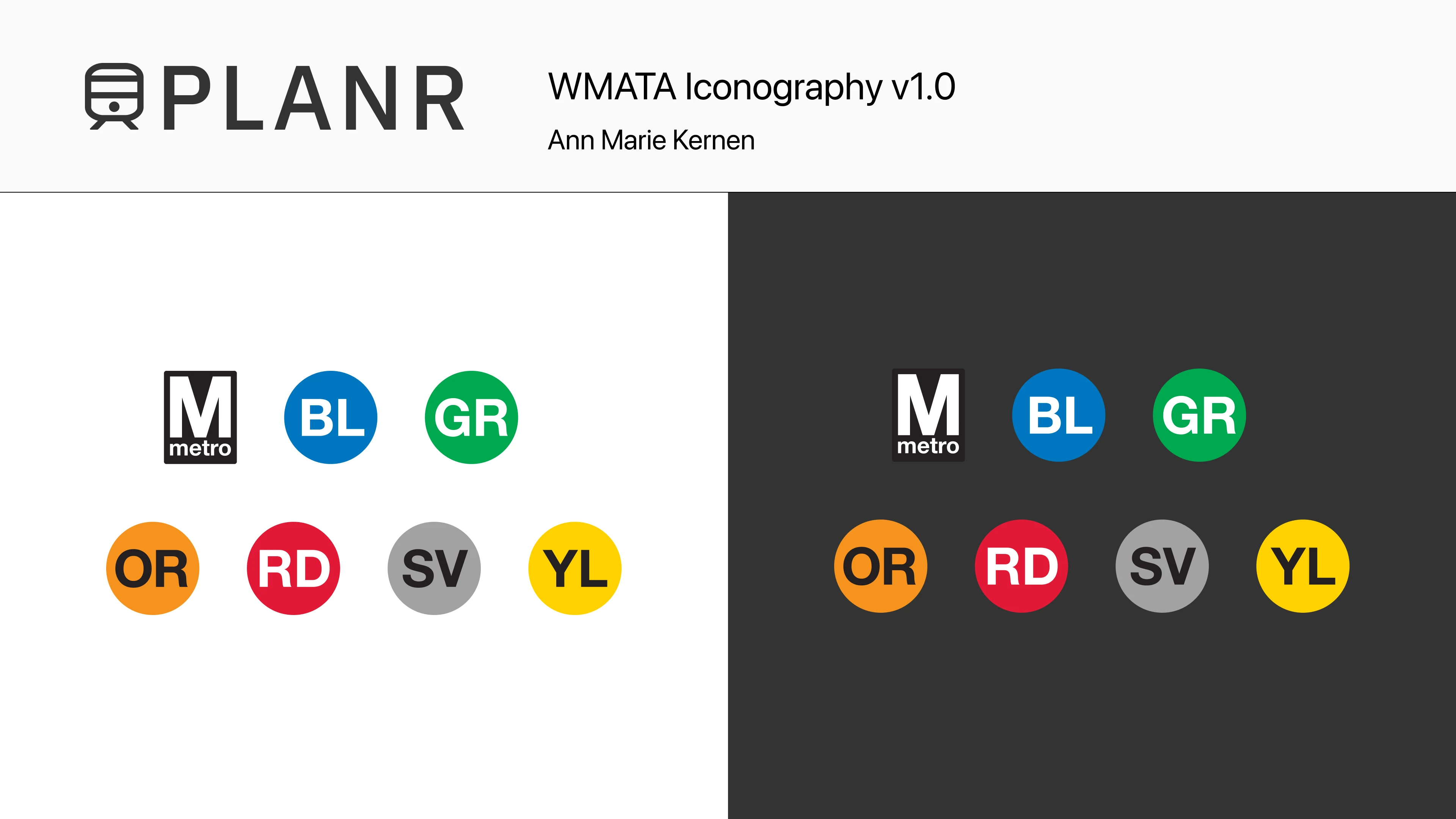
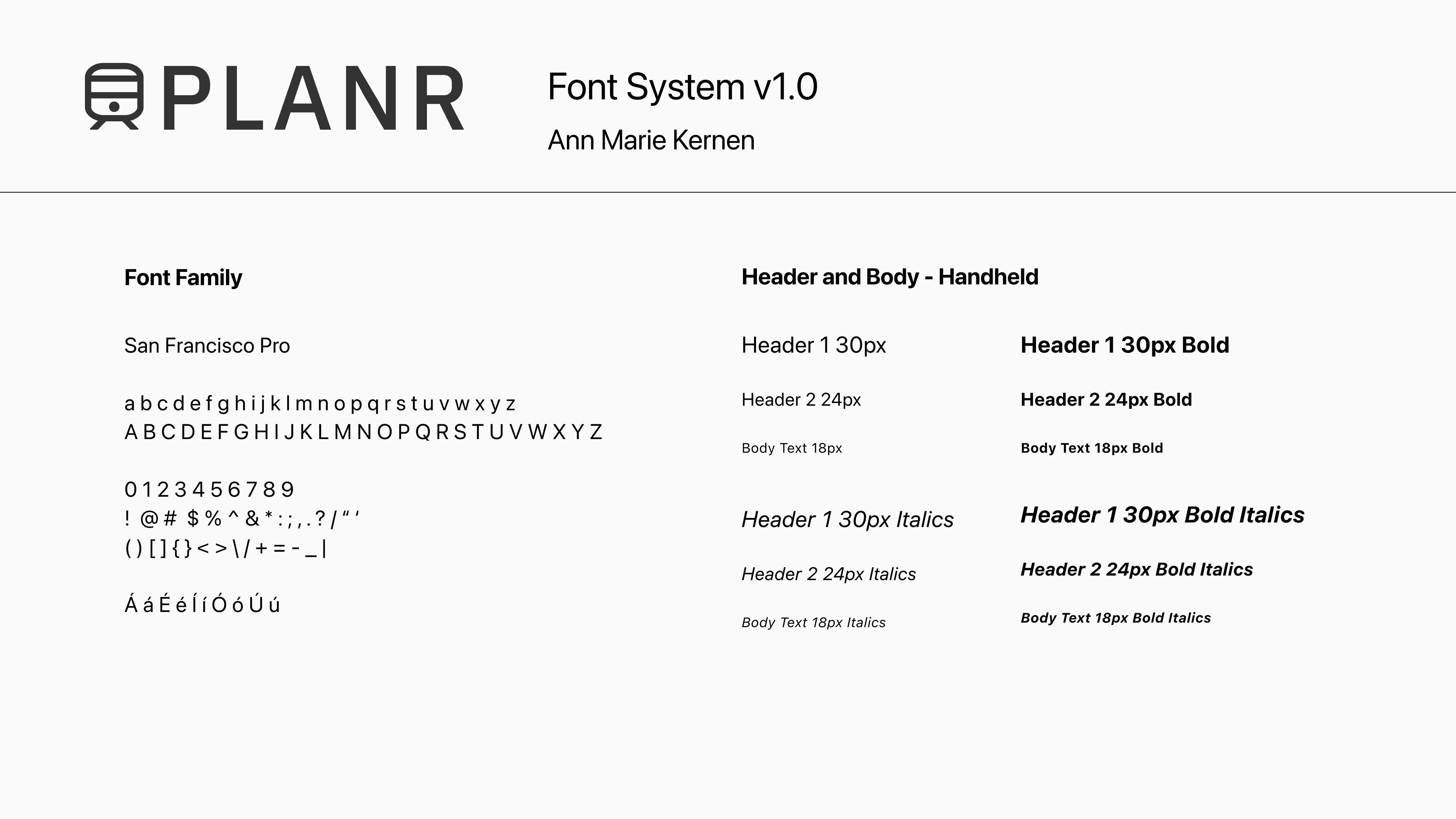
Early style guide
Separately, I worked out a simple color, type, and icon system that I could use to graduate to a higher fidelity prototype.
Hi-fidelity Flows
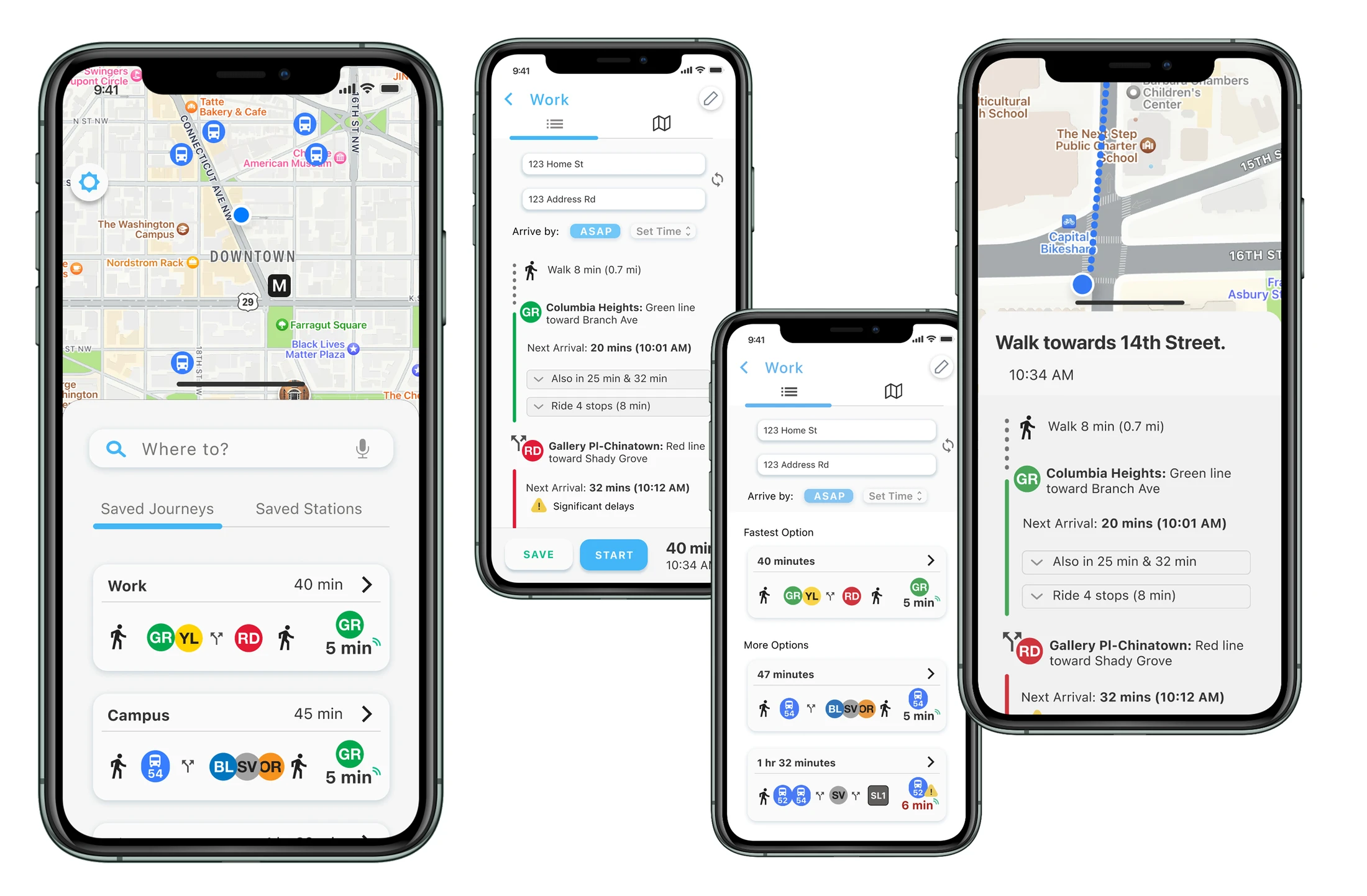
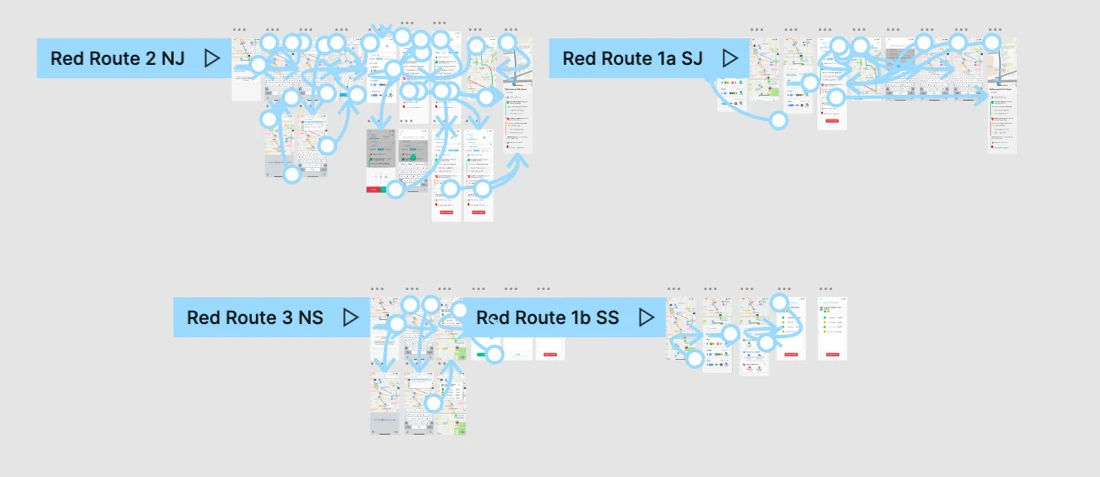
I chose the 4 core “red routes” that I’d start with in the hi-fidelity prototype:
- Look at a saved journey
- Start a new journey
- View/save a new station
- Look at a saved station
Outcome
To test the final MVP prototype, I ran unmoderated usability testing on Maze for the four flows shown above. Users hit a 96% success rate (n=26), which was great!
Although this was a “bootcamp” project & not actual work experience, I really treated PLANR as if it were real, and as a result learned so much from this project.
PLANR was my first time really “designing” a product. Meaning it was the first time I felt that: wow, this crazy idea I had of becoming a designer…might actually be within reach! 🥹
You’ve reached the end of my case studies.
Thank you for reading! Please feel free to reach out with any questions or feedback.
If you'd like, you can continue on to my side projects. First up is Midjourney ⛵️
ContactNext Page: Midjourney